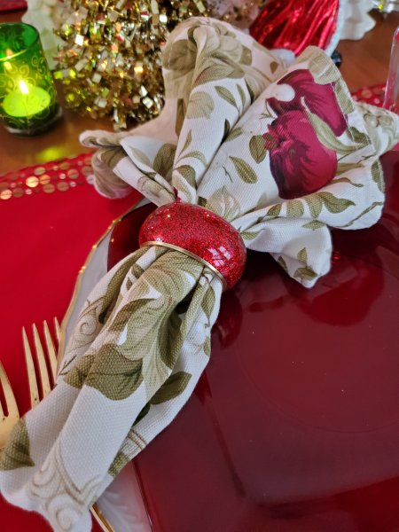
I have a lot of fun putting together centerpieces for my tables – to me it’s one of the most creative aspects of tablescaping! I admit I do go over the top sometimes, and not just at Christmas. 🙂 I’d like to share a few Christmas centerpiece ideas and inspiration pictures with you, not in the spirit of suggesting you copy them exactly (unless you want to!) but in the spirit of illustrating that centerpieces can be creative, fun, inexpensive, and imperfect – and still add to the beauty of the table and the enjoyment of the meal!
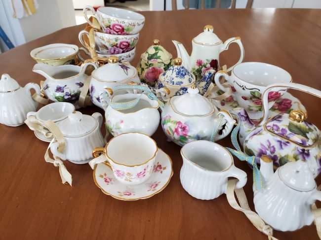
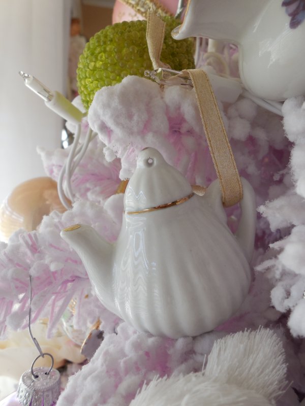
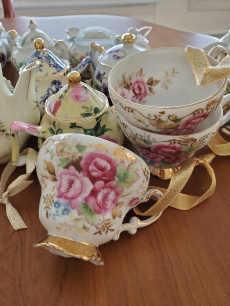
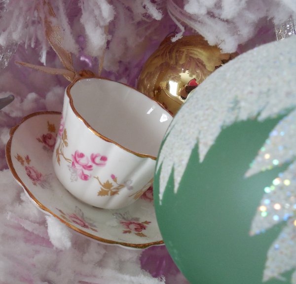
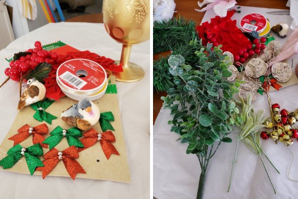
Also, note that everything shown in these photos has all come from thrift stores and other second-hand sources – so I feel like it’s “no harm done” to the budget when collecting these items, many of which can be re-used in other seasons.
Here are the types of centerpieces I usually create:
Quick, simple containers:
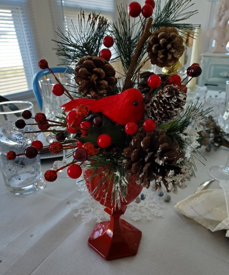
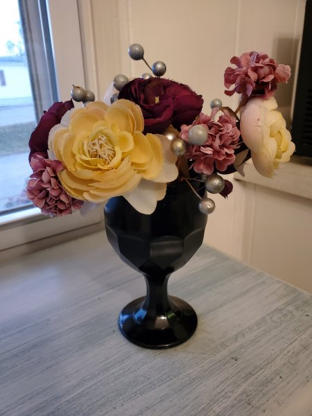
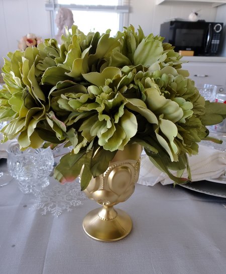
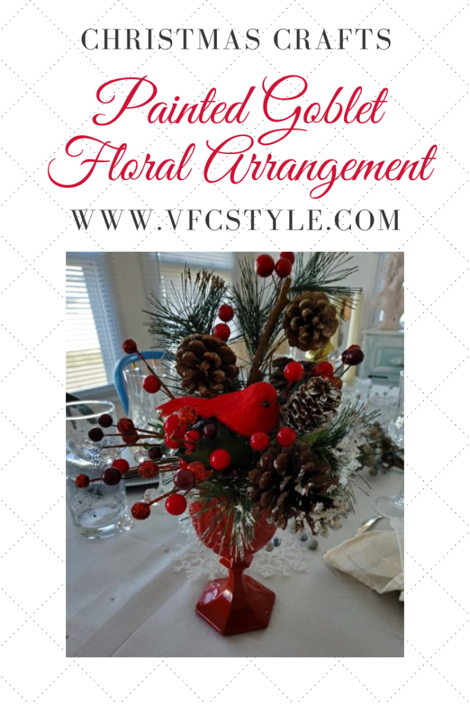
These are super-easy! I’ll generally “shop the house” for a vase, bowl, or other container and fill it with silk flowers (or real, if I’ve splurged!) or other items that enhance the theme of my table setting or evoke the season. Now granted, I shop thrift stores often for these types of containers so when I “shop the house” I’m very likely to find something suitable – but that’s the fun of thrifty tablescaping: buying stuff on the cheap so you have lots of options when the time comes! Here are some examples of easy container Christmas centerpieces.
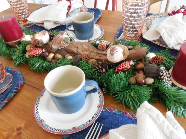
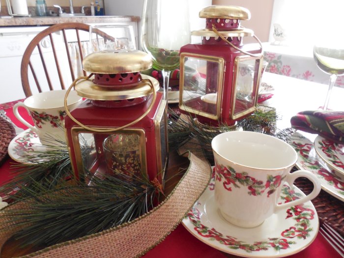
Runners and ramblers:
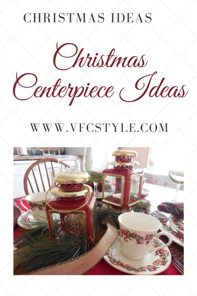
I’m not sure if there’s a “real” name for this style, I just call them runners or ramblers because they run a portion of the length of the table or just ramble down the middle. I usually start with a bed of something: maybe greenery or a piece of fabric, and then just build on top of that with items that support my theme or colors. These are always fun because you can tuck unexpected little items into them. Here are a couple examples:
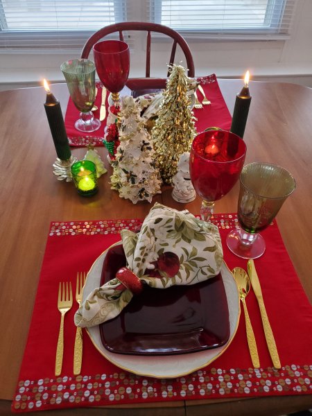
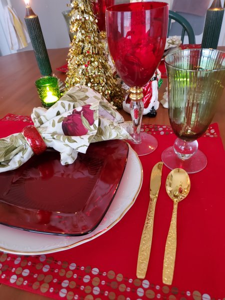
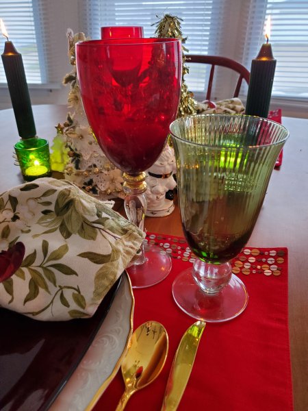
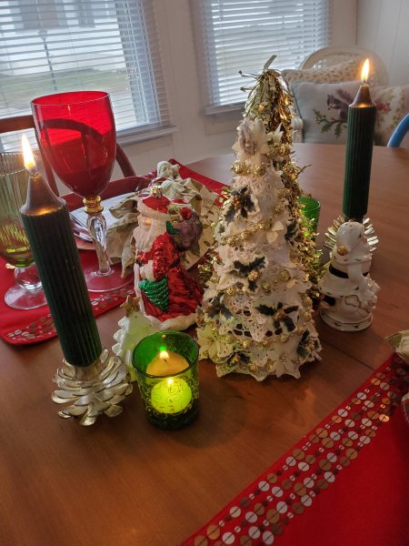
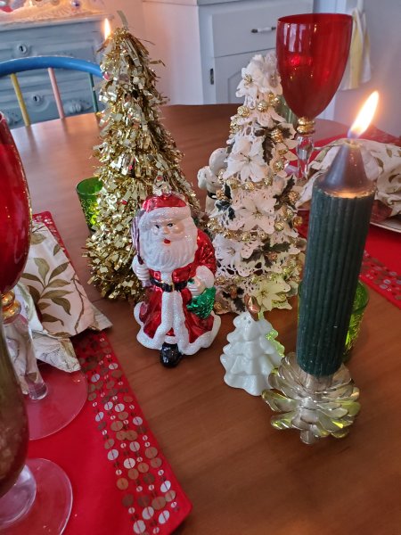
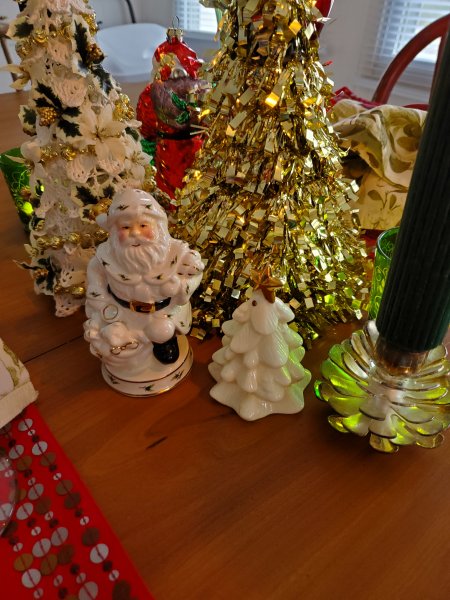
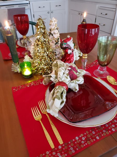
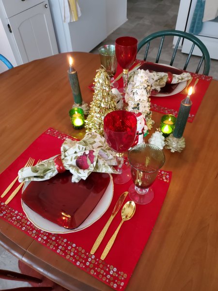
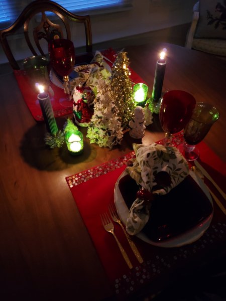
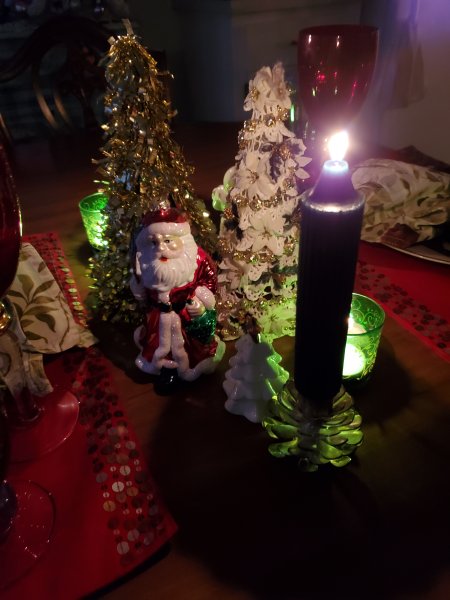
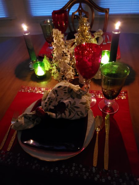
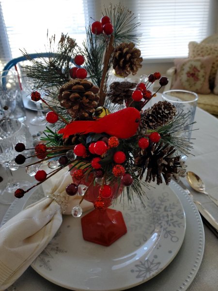
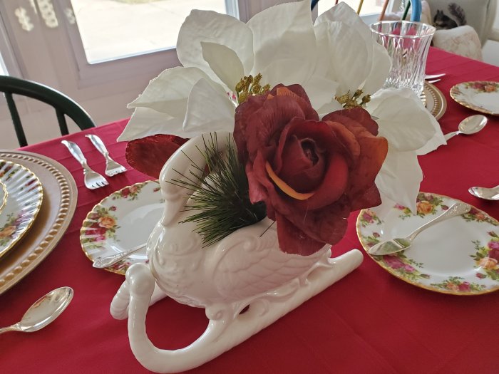
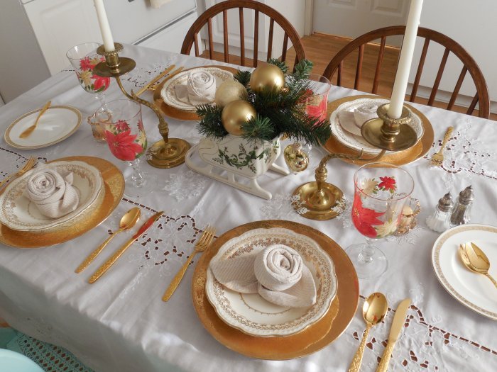
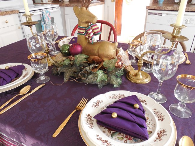
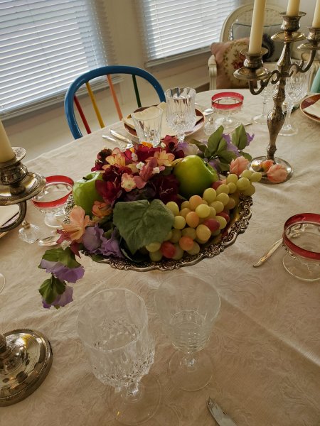
Symmetrical Style
Another favorite – and very common – Christmas centerpiece style I like to use is just a symmetrical arrangement with a center “feature” element flanked by (usually) candles or other smaller elements. Here are a couple examples of that!
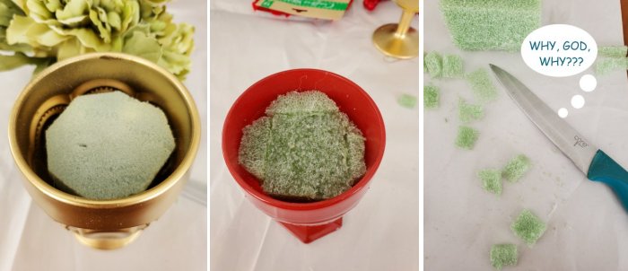
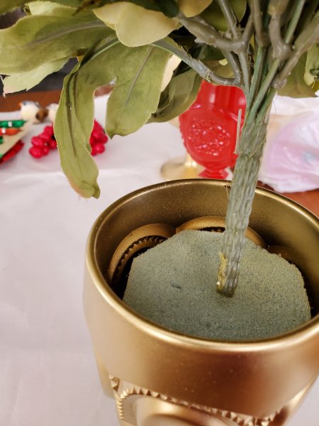
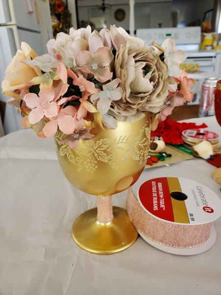
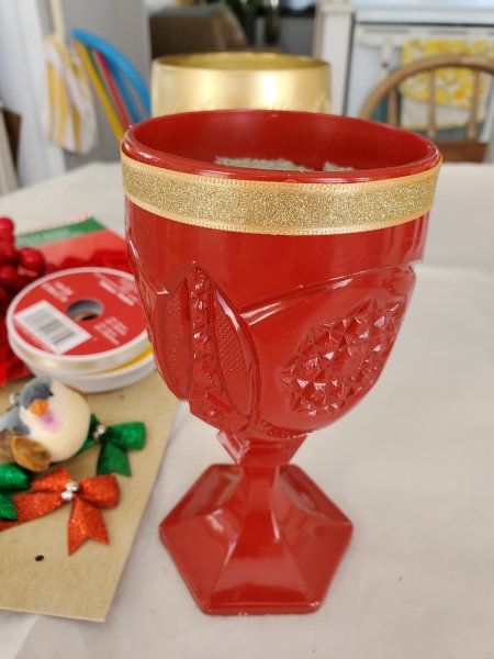
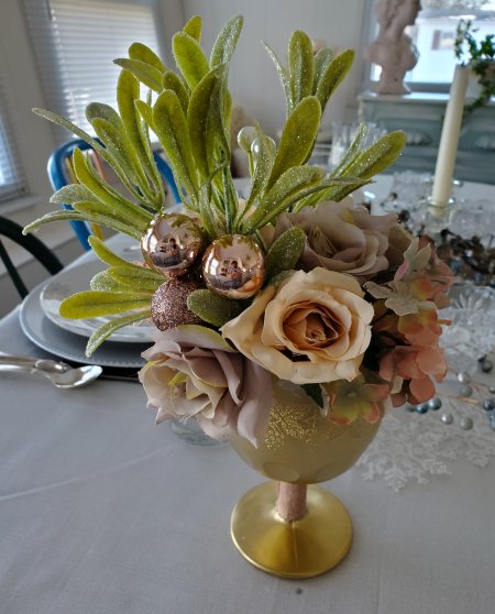
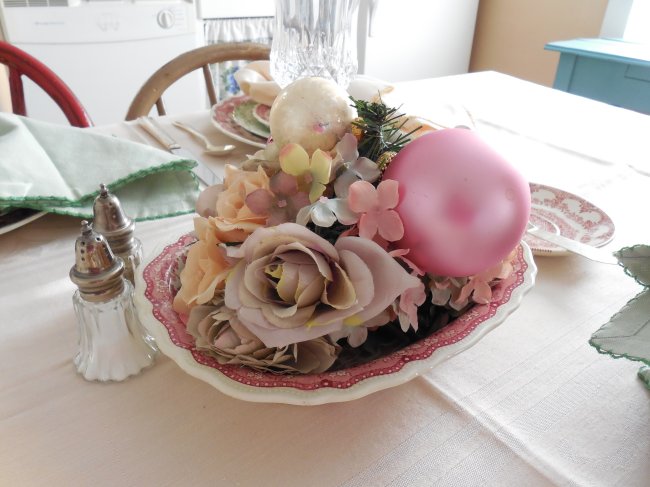
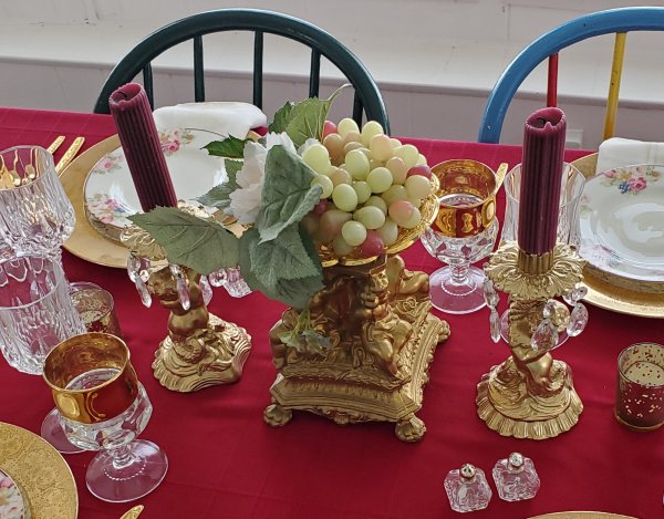
Epergne Elegance
You might have to actually search Google for “epergne” images to see what it’s supposed to be (and how it’s pronounced – “eh-pearn-ye” in French, “eh-pearn” in English?) … to me an epergne is a tall-ish thing with a vessel at the top for holding flowers or food, and maybe even smaller vessels (attached) surrounding it to hold more flowers or food. There are a lot of beautiful antique silver ones out there, and I have tried to cheat this look on a couple of occasions. Although my efforts would never put Gilded Age hostesses to shame, I really love the “budget look” I’ve been able to achieve. While neither of my epergne examples are technically a Christmas centerpiece, I’m sure you can easily envision how they could be adapted:
Hopefully these pictures have inspired you – to build a second-hand stash of your own, shop your house for containers and other elements, cheat your favorite high-end looks, and above all have fun playing with seasonal elements to create a less-than-perfect centerpiece that brings you Christmas joy and gives you something to talk about around the table!
Do you have a favorite style of centerpiece you enjoy creating? What is your go-to container for fresh or faux flowers? What will you create this Christmas to spark conversation at your dinner table? Please share in the comments!
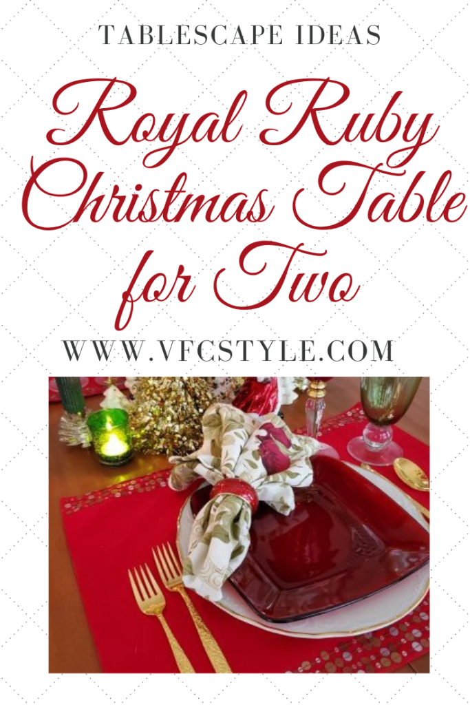
Here’s an image to Pin if you’d like to save this post for future Christmas centerpiece ideas!