I wasn’t going to do a July 4th tablescape – I don’t really have any themed dishes for this holiday, and I didn’t want to buy anything new. But I decided to give it a go, when I realized that all I really needed to do was to shop my own stash – SURELY I could pull something together with items I already owned? That’s the thrifty way, after all!
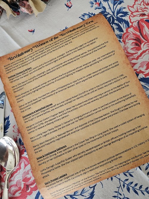
Now I admit I was firmly entrenched in my TV-watching chair when this occurred to me. So while I was thinking about what I might pull from my cupboards, I happened to watch a short video on YouTube about a museum that housed a number of Revolutionary War era artifacts. One of these was the now-famous letter written by Abigail Adams to her husband John, remanding him to “remember the ladies” when drafting the documents essential to forming the new nation: “…be more generous and favourable to them than your ancestors. Do not put such unlimited power into the hands of the Husbands.”
The fact that Mr. Adams didn’t listen to his wife is a subject for a different blog, but it did spark a thought: “Were there other women who attempted to have some influence over the forming of the nation? What else did they do – by their words or actions – to further the cause of the Revolution?” A quick Google search yielded some very interesting results, which I compiled into an element used in the final tablescape.
So with all of that – using my stash, the concept of “interesting women of the Revolution,” and an idea for how to use my newly discovered information – I decided to dedicate my tablescape to those extraordinary women who used their time, their intelligence, and their talents to further the great cause of achieving independence. Here is what I came up with!
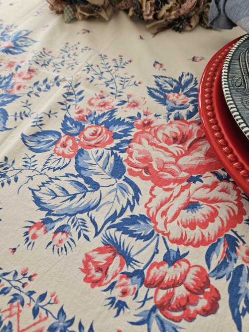
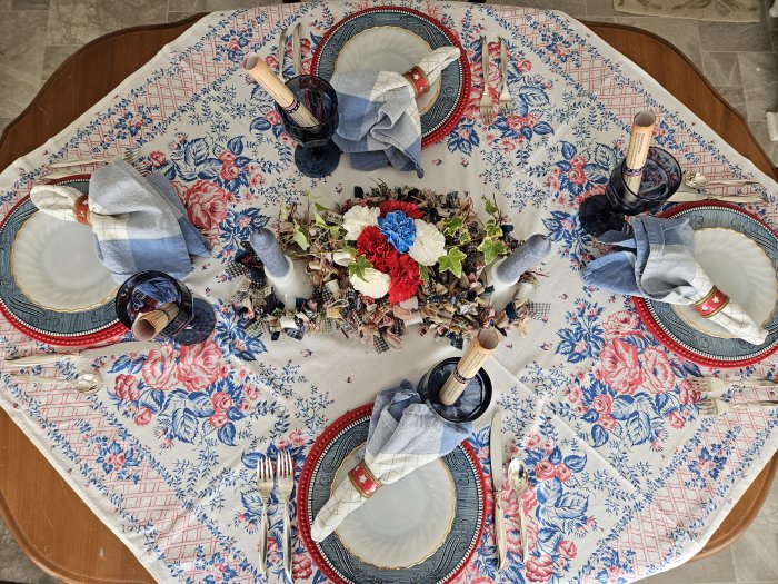
As I mentioned, I didn’t have any themed dishes. But I did have elements in red, white, and blue, so I decided that the July 4 theme would be established through the use of color. I also chose items when possible that could be interpreted as at least vaguely historical. You’ll see what I mean in the pictures.
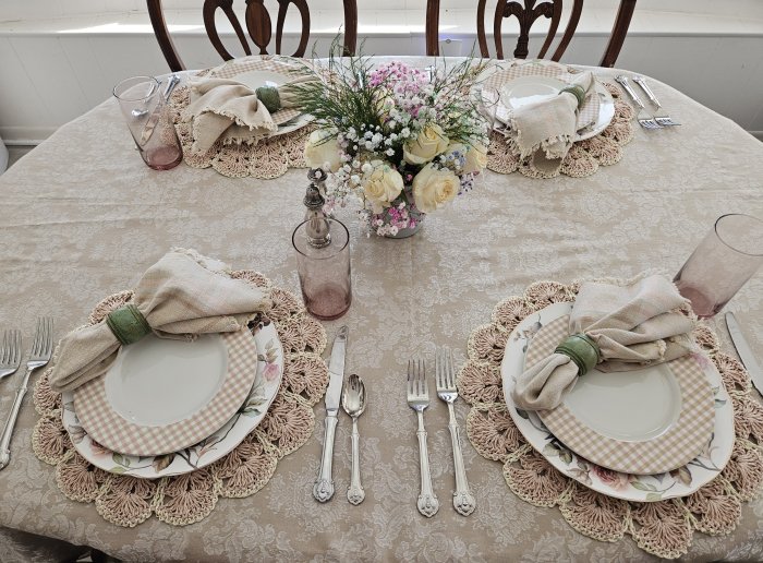
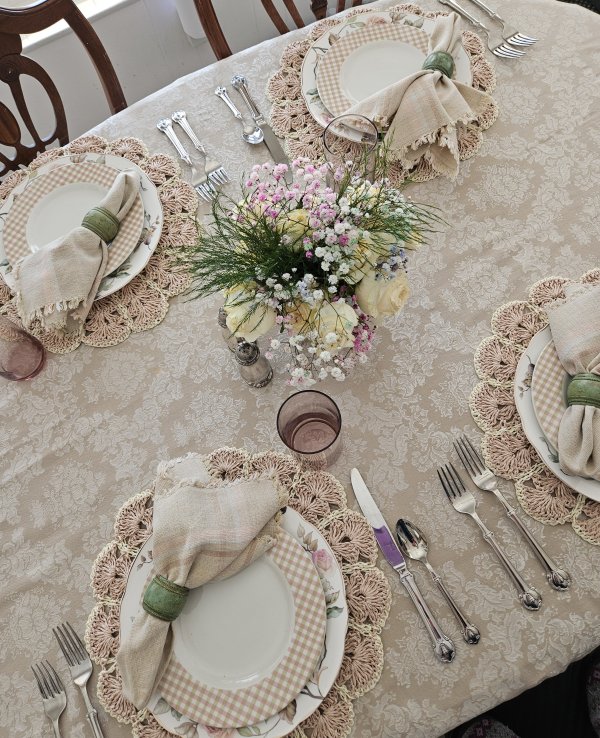
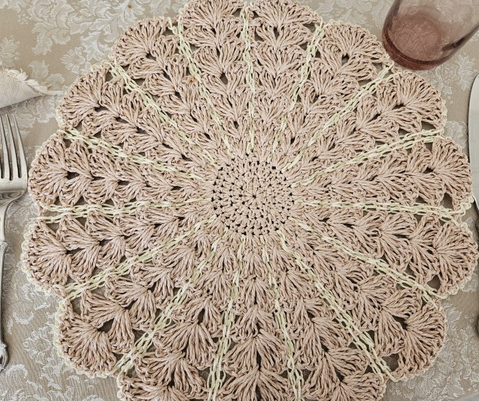
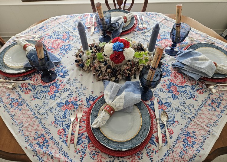
I had a couple options for color-appropriate tablecloths, but ultimately chose this one because to me it just set off the plate stack a bit better than the other choice.
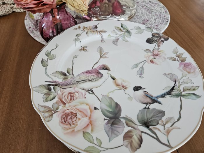
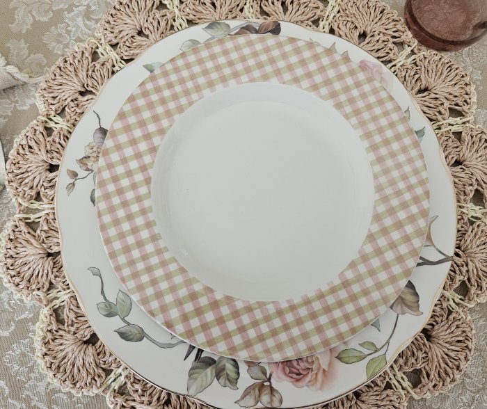
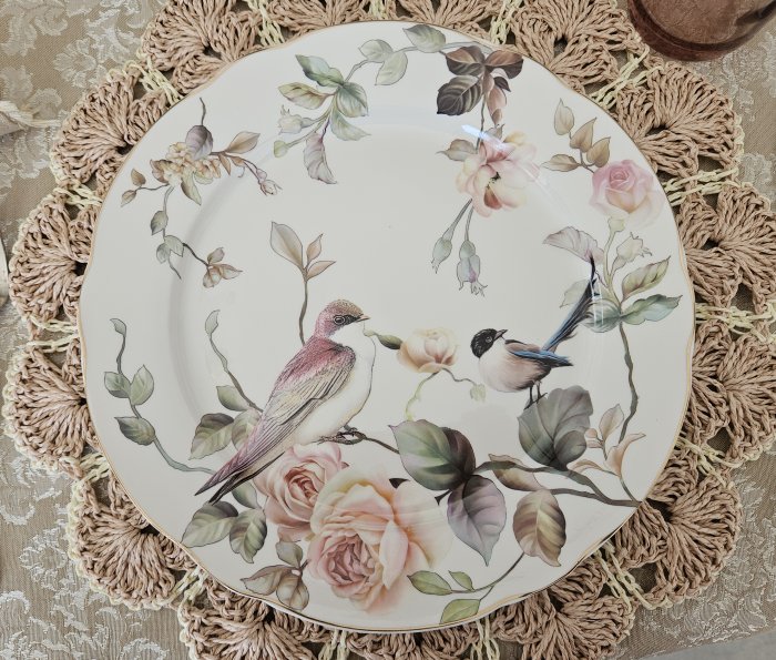
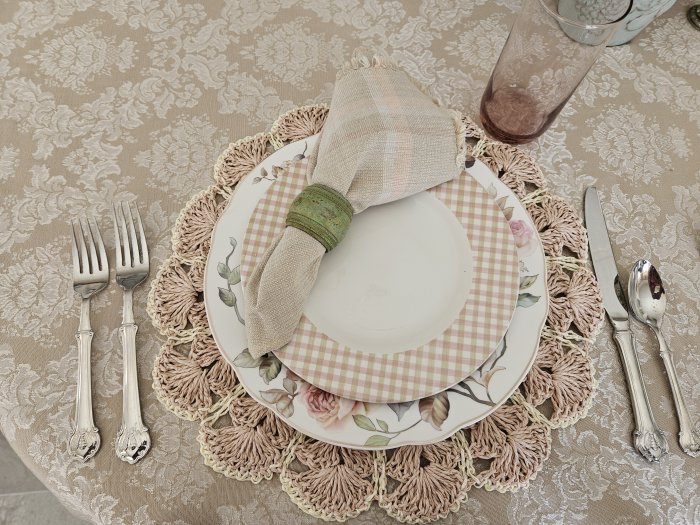
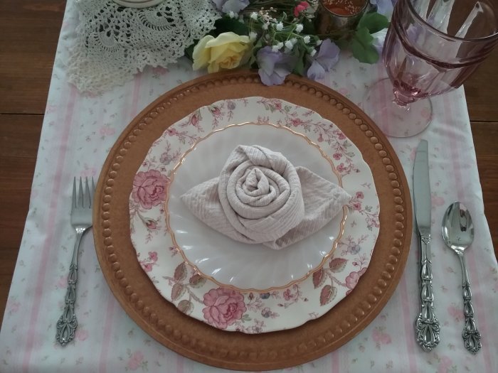
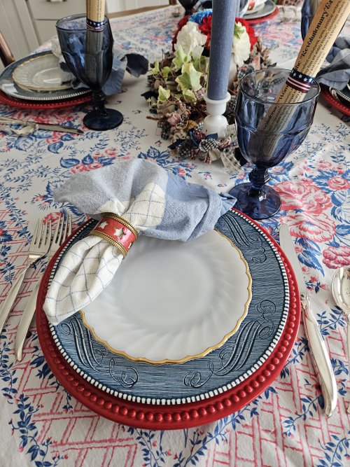
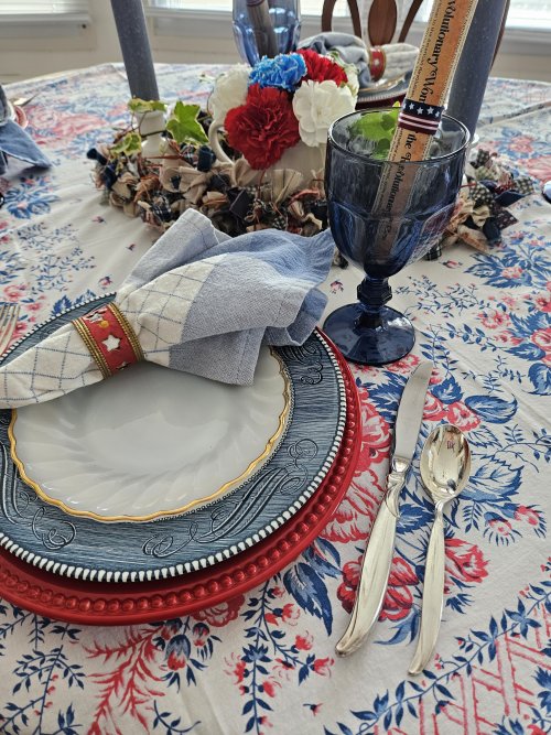
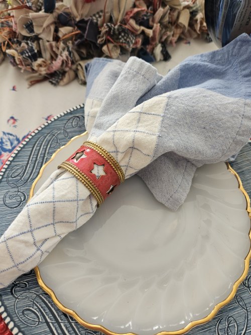
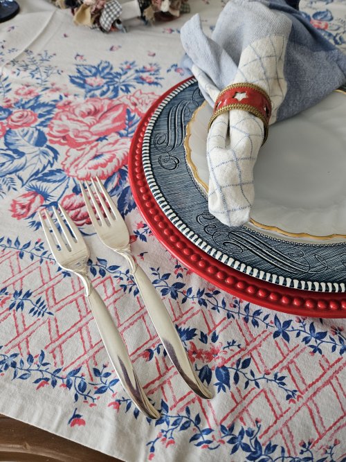
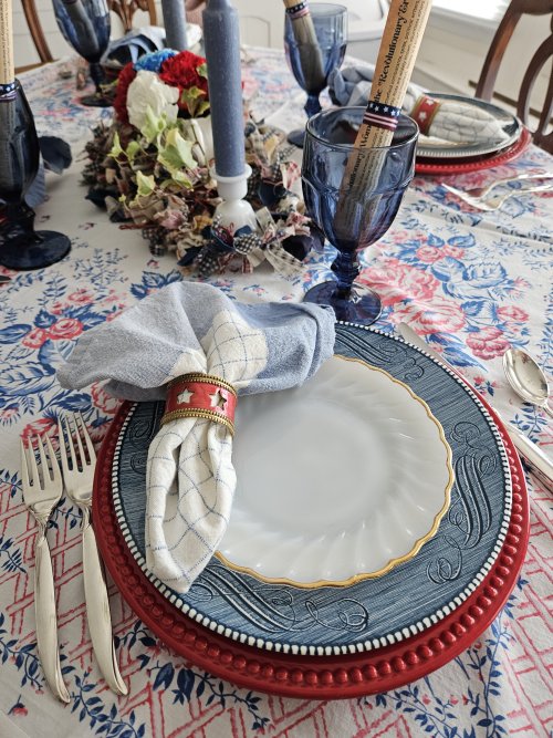
The place setting stack starts with white – pretty scalloped Fire King salad plates with a gold-trimmed edge.
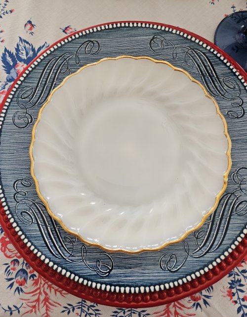
The dinner plate brings blue to the stack and has that historical element I mentioned. These are “Currier and Ives” by Royal China, depicting their famous print image, “The Homestead in Winter.” I inherited these from my Great Aunt Hazel.
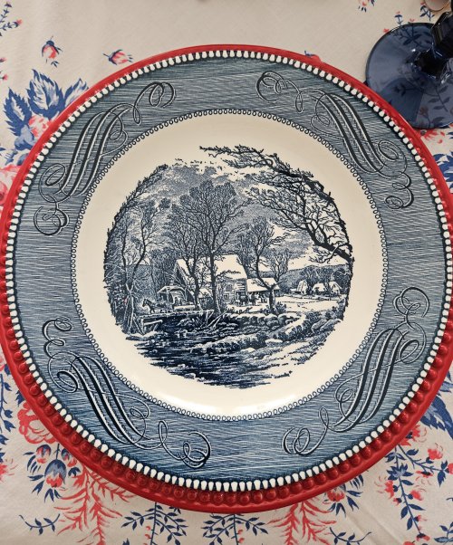
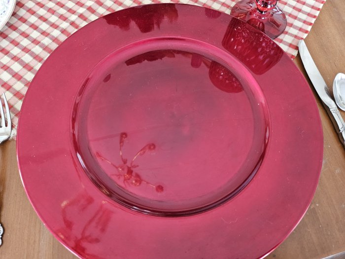
I’m using this red Dollar Tree plate as a charger, because it’s slightly larger than the blue dinner plate and brings in the color red to the setting.
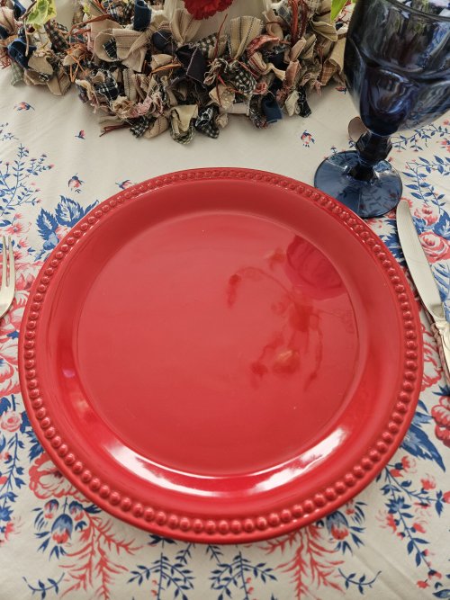
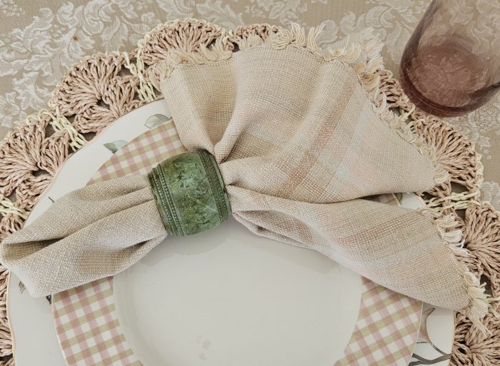
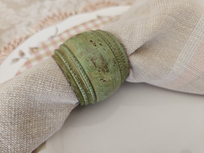
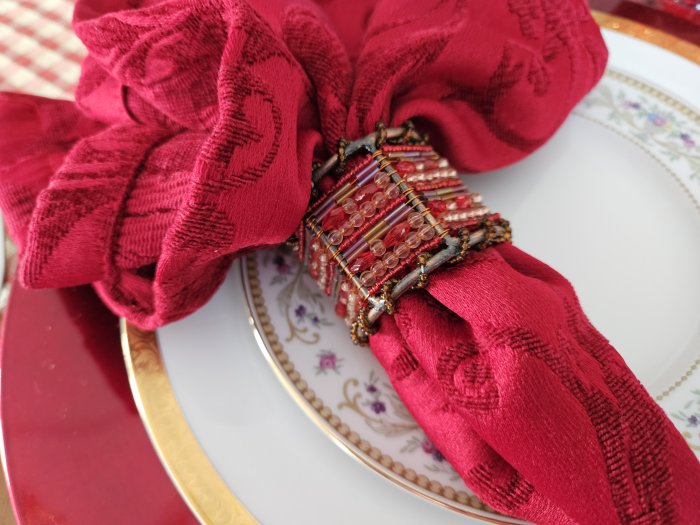
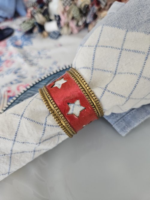
I’ve used these metal napkin rings before at Christmas, but I think the star pattern also works well here.
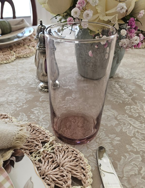
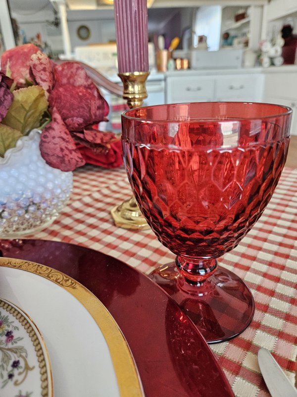
I had a couple of choices for glassware, but settled on this set of vintage Libbey “Gibraltar” in a dusky blue color that pulled from the Currier and Ives dinnerware. Oddly enough, I had some long-stemmed wine glasses also in this color, but this pattern seemed more at home in this particular table setting – they are reminiscent of Fostoria Jamestown, with the wide pane pattern, but are a darker blue. I think that wide pane pattern has more of an “early Federal” look to it.
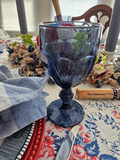
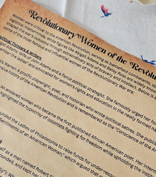
Here’s where my Google search for interesting women of the era came into play! I used the information from my search to create a little scroll for each guest, providing a brief introduction to each of 12 “revolutionary women”!
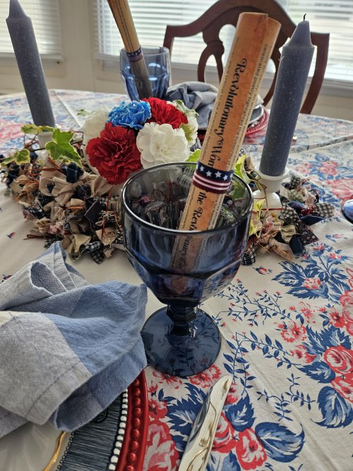
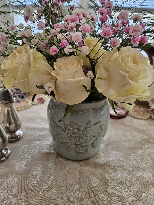
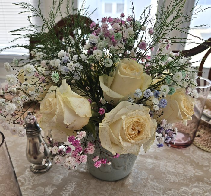
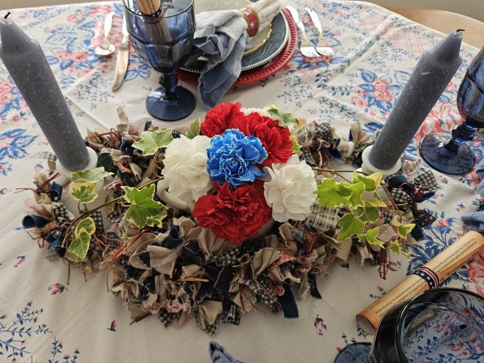
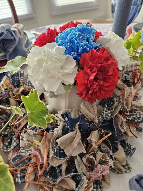
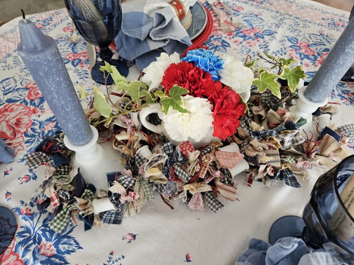
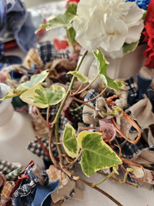
Our centerpiece contains the only items I purchased new for this table: fresh carnations! I arranged them in a little white ironstone vessel, which repeated the “federal-looking” wide pane pattern of the glassware, along with fresh ivy sprigs cut from one of my garden containers. Chunky taper candles in vintage milk-glass holders flank the flowers, which are also surrounded by a primitive-style garland of fabric scraps and empty thread spools.
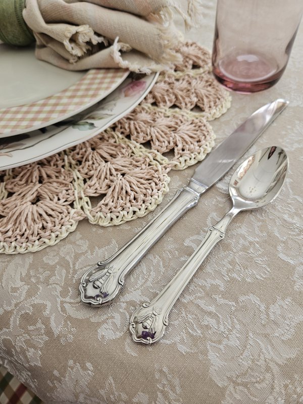
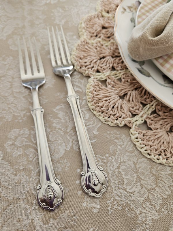
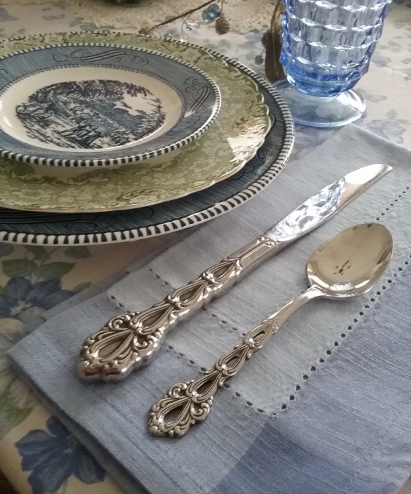
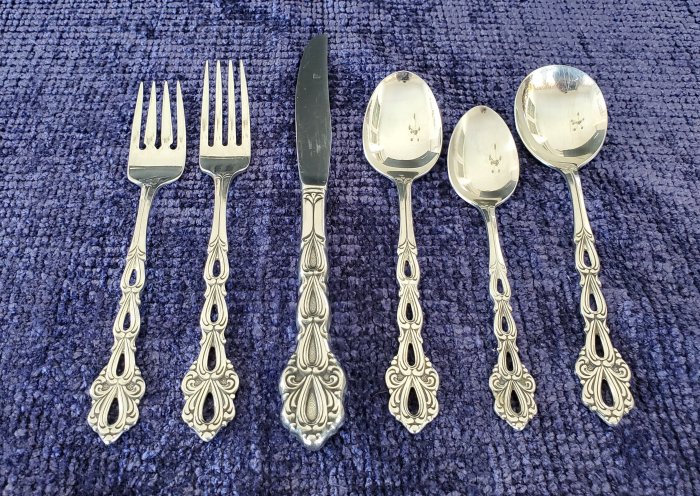
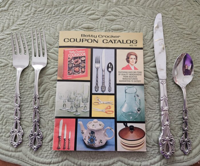
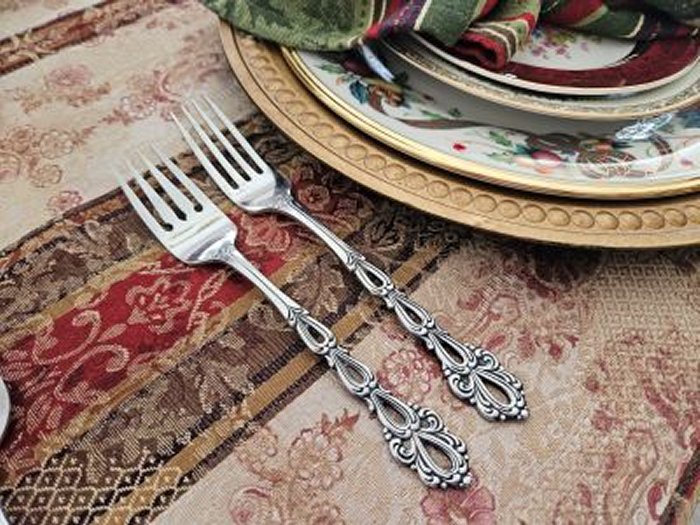
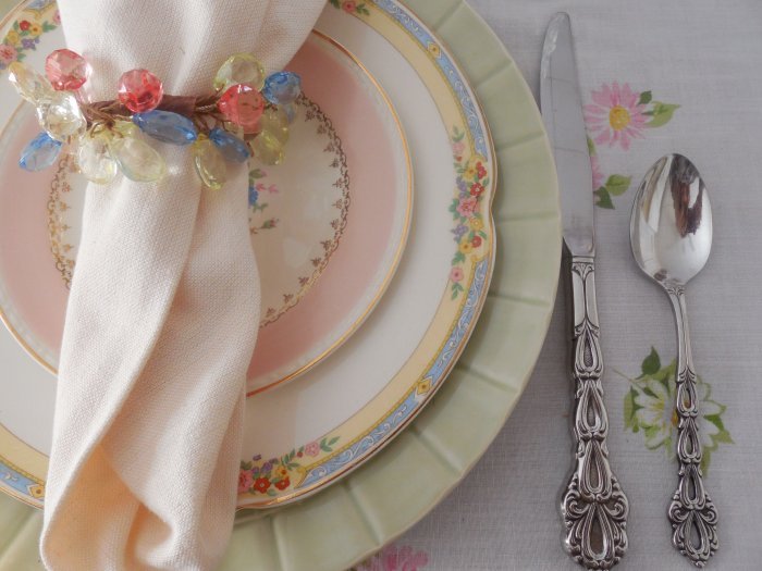
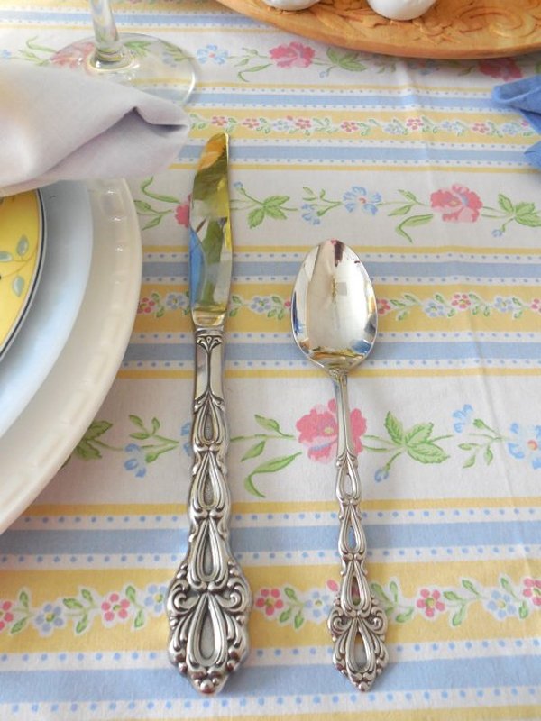
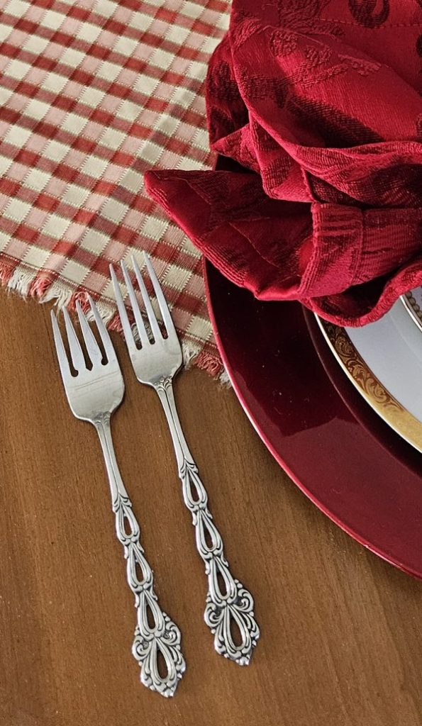
Flatware is my vintage “Flair”silverplated flatware by 1847 Rogers Brothers, gifted to me by my grandmother Verdie – a set we used regularly at family dinners in her home while I was growing up.
Here are a few more views around the table:
Here is the birdseye view of the full table from my perch atop the step-stool!
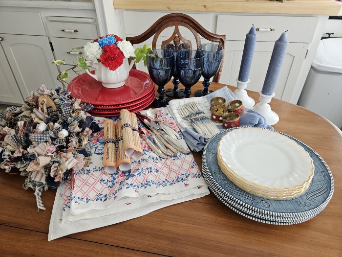
And here’s the put-away shot, where all the elements are gathered up while waiting to go back into the cupboards:
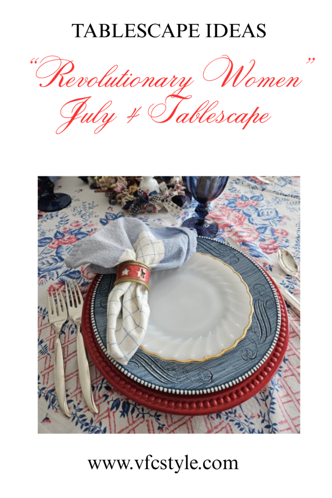
Finally, here’s an image for Pinterest in case you want to save this post for future ideas!
I am linking my “Revolutionary Women” tablescape to Susan’s incredible blog, Between Naps on the Porch, where she is celebrating the 927th (yes you read that right!) Tablescape Thursday link party! Be sure to click through for more gorgeous tablescape inspiration!
Wishing you and yours a happy and safe Fourth of July celebration!