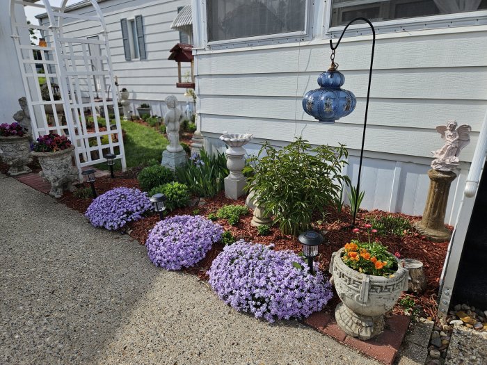
Last year was probably the best year so far in gardening here at our little mobile home. I’ve been working hard to put in perennials so I have less in-ground work to do each year, and there are finally some areas that have filled in to where they look like the kind of busy, “overstuffed” borders I’ve been dreaming of.
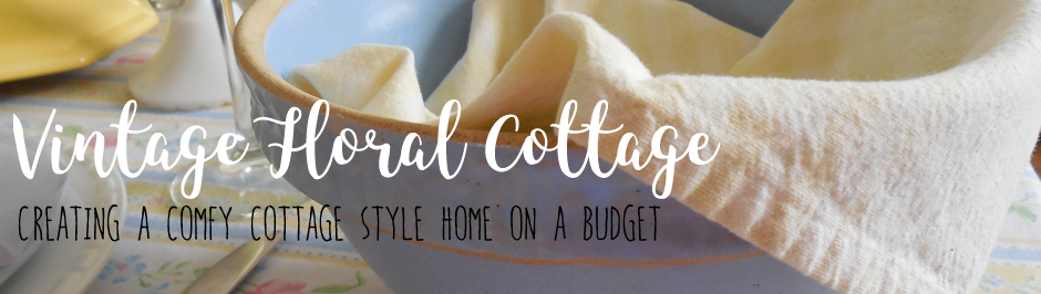
Perennial wild geranium, echinacea, and coreopsis.
I do still have fun with annuals, though, filling a variety of containers each year.
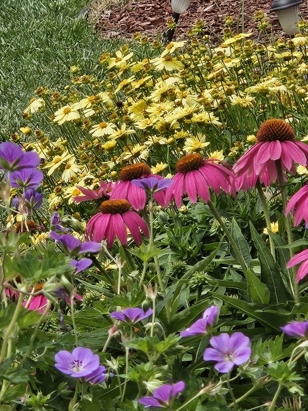
Annual variegated nasturtium, ageratum, lantana, and coleus.
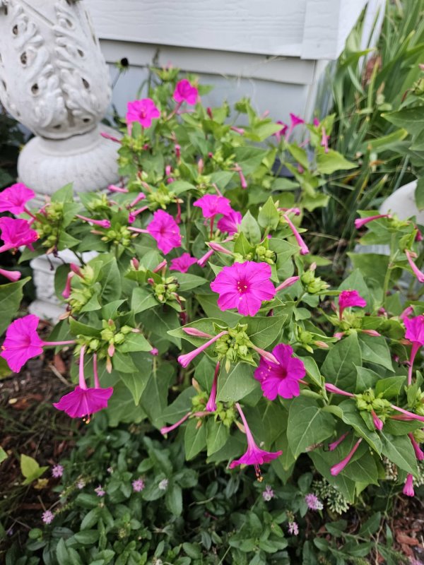
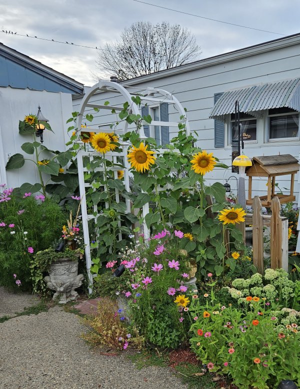
In 2025, the only annuals I did in-ground were the zinnias, Four o’clocks, and sunflowers, which I plant every year from seed. Honestly I don’t think I’ll EVER stop growing these – they’re just too easy, too beautiful, and too much fun!
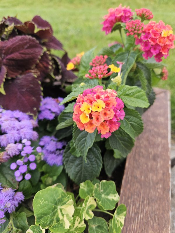
Zinnia “Cut and Come Again”
Annual Four o’clocks – a classic, old-fashioned summer favorite.
Pretty sure these sunflowers are the “Lemon Queen” variety
One of the reasons I like gardening in Iowa (I’m Zone 5b) is because we have four seasons, and one of those is an “off-season.” That means we get a break from about about November through February, where we’re not actively working in the garden. It’s a nice mental and physical break that always seems to come just as I am losing momentum, motivation, and interest. And then, by the end of February, I’m itching to get started again – somehow it just always seems to work out!
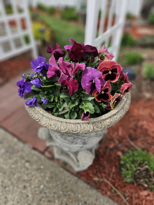
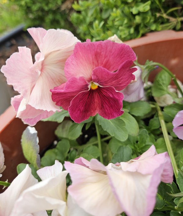
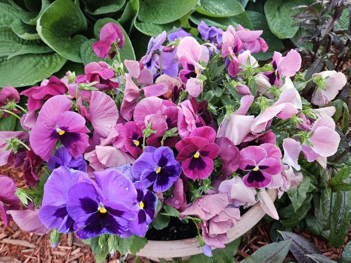
For early Spring color, I’ve found it’s hard to beat pansies and violas. I don’t have the indoor space to start these from seed, but it seems like the garden center at Lowe’s starts carrying them just as I’m itching to get back outside. I loved these pansy combinations from last year, and because they are so long-lasting I was able to move them around to several different containers until well into June:
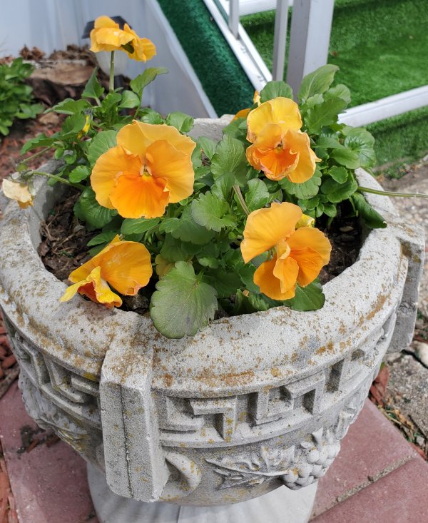
And, these happy yellow violas are a refreshing pop of early color!
And this year, for EARLY early color, I’m expecting crocus and daffodils for the first time because I did plant some bulbs last Fall. I’m anxious to see them come up!
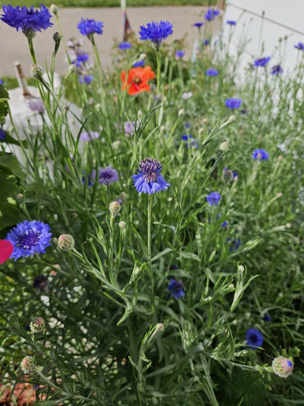
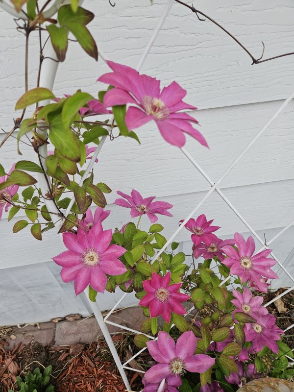
There will also be Bachelors Buttons – these tend to self-seed, but I also add new seed every year. I’ve also learned that my perennial clematis is an early Spring bloomer.
Cornflower (Bachelors Buttons) Dwarf Blue
Clematis – but a variety I don’t recall.
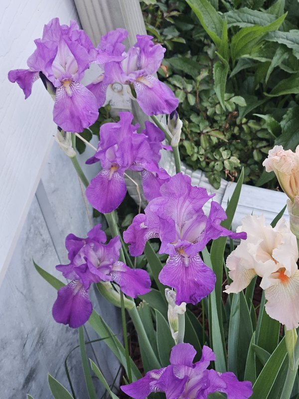
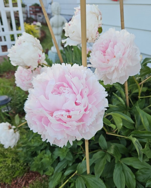
By May, some of the perennials will be blooming such as the creeping phlox, iris, and peonies.
Creeping phlox
Iris
Peony “Sarah Bernhardt”
There are also several summer favorites, including coreopsis, salvia, echinacea (coneflower), wild geranium, hostas, and garden phlox. I’ll save those for another post, and I’ll also try to do a post about specific plans for what I’m hoping to achieve this year. But for now, suffice to say I’m looking forward to another year of gardening!
How about you – what are your favorite annuals to use in containers, and do you have a favorite perennial that seems to successfully fill in your flower beds each year? Tell me in the comments!
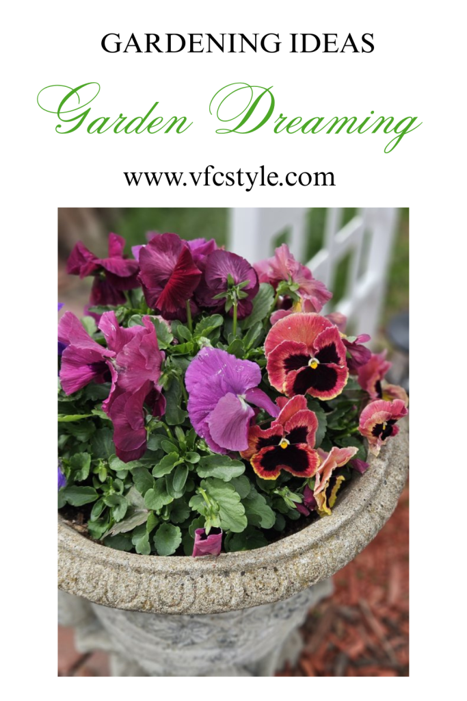
Here’s an image to Pin in case you want to save this post for future reference!
(All text and images copyright Janet Green 2026, unless otherwise noted.)
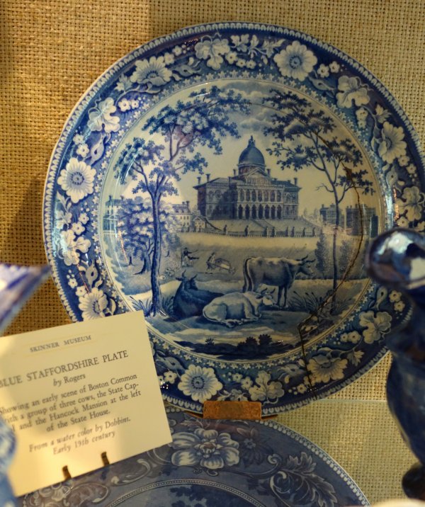
Have you ever looked closely at a piece of Johnson Brothers Old Britain Castles dinnerware and become curious to learn more about Blarney, Cambridge, or Stafford Castle? If so, then you’ve experienced the hidden super-power of classic transferware!
In the early 19th century, British potteries began producing large quantities of illustrative transferware aimed at a growing American market. The pieces produced by Clews, Ridgway, Enoch Wood, Johnson Brothers (pre-Castles), and others depicted American pastoral landscapes, architectural scenes of New York and other cities, river scenes, and natural wonders such as Niagara Falls.
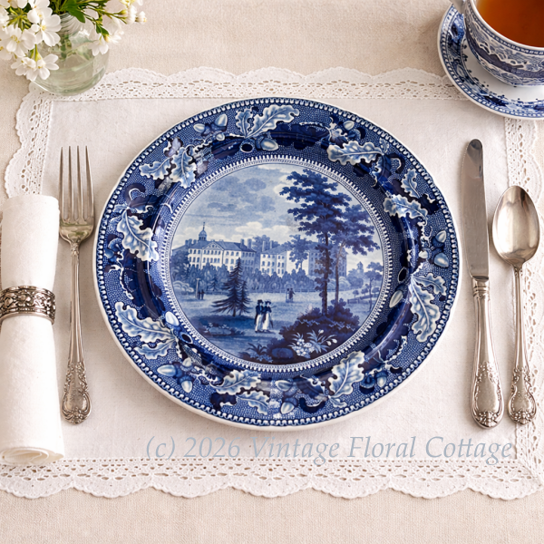
Harvard College plate by Enoch Wood & Sons, circa 1835.
These dishes were affordable and beautiful, and the designs subtly served as visual history lessons at a time when books were expensive and literacy was not universal. Dinnerware could literally show Americans what their country looked like beyond their front door, and build a sense of national identity through depictions of events, landscapes, and architecture.
In her collector’s volume The Blue China Book, first published in 1916, Ada Walker Camehl states “… this group of English pottery is not only a valuable record of the American country and cities as they appeared a century ago, but is at the same time a surprisingly complete history of the first three centuries of our national life.”
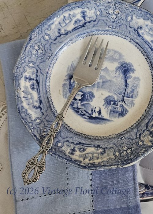
Allegany plate by Thomas Goodfellow, circa 1840.
As it turned out, Americans – who at the time still believed that superior pottery came from England – were eager to snap up these pieces, seamlessly blending history into domestic life. For transferware at this time was not relegated to display cabinets – it was handled, washed, stacked, and used daily. Through repetitive use, the imagery of transferware became part of our collective conversations and knowledge.
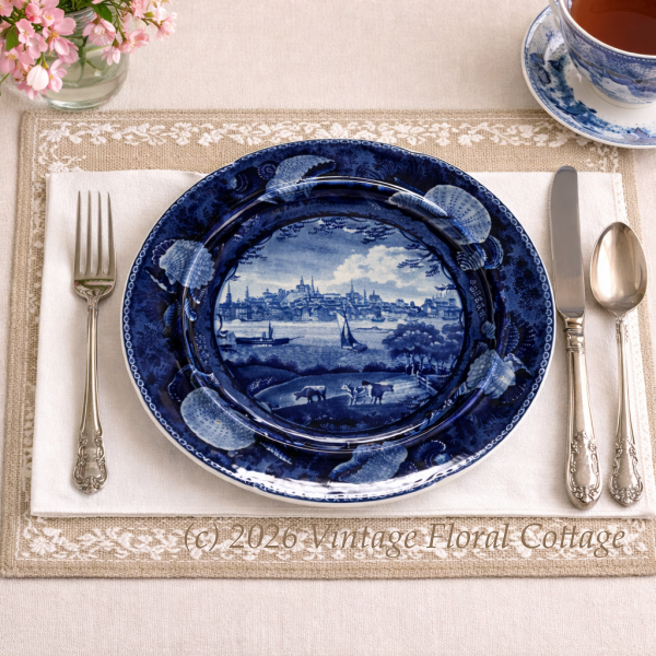
Scene of Albany, New York by Enoch Wood & Sons, circa 1830s.
What’s interesting about the images themselves is that, for the most part, they were created by illustrators working from pictures by established, “published” artists. While a few potteries sent their staff artists “across the pond” to make their own sketches, more often they worked from existing paintings, prints, and even sketches from the notebooks of returning English tourists.
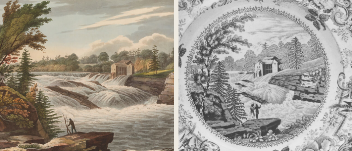
For example, the Irish-born artist William Guy Wall is one of the most influential figures for American-view scenic transferware. His successful print series known as the Hudson River Port Folio was eagerly adapted by English potters. These pictures depicted scenes of a naturally beautiful but culturally refined America, where nature coexisted peacefully with civilization. Educated in European artistic traditions, Wall created carefully balanced compositions showing that America had landscapes equal to those in Europe, believing that they deserved to be seen and remembered. Wall wasn’t just painting scenery – he was stylizing, editing, and curating his pictures to depict how America wanted to see itself and how it wanted to be seen by the world. Because of the established popularity of the pictures from the Port Folio, pottery depicting these images was practically guaranteed to be successful on the commercial market. Thus, many Staffordshire plates trace their origins directly to Wall’s compositions.
Detail from William Guy Wall print, Bakers Falls, (1820) from the Hudson River Port Folio (left) and from a brown and white Clews Staffordshire transferware plate. Public domain images from metmuseum.org.
Additionally, although they depicted American subjects, the wares were engraved and produced in England. As a result, early American history was filtered through British artistic conventions and romantic ideals.
These additional filters, or layers of interpretation, explain why American buildings sometimes appeared slightly altered, landscapes were softened or felt grander than reality, and proportions leaned toward the English Picturesque style. These visual choices reveal not only what was depicted, but literally how history was framed for consumption. The dinnerware did not merely reflect culture; it actively participated in shaping it.
Despite the English artistic influence imposed upon American scenes, Camehl nonetheless concludes in her book that “So thoroughly did the early nineteenth-century artists perform their task of securing sketches of American scenery… that it is quite possible by means of the decoration… to enable the student of our early history to make a fairly complete tour of the land, and to look upon it as it appeared a century ago.”
By the early 20th century, as American tastes changed, the educational direction of transferware had also shifted: English potters began introducing American consumers to British history and heritage. One of the most beloved examples is the afore-mentioned Old Britain Castles by Johnson Brothers introduced around 1930 and still widely collected today, almost 100 years later. These scenes of castles, abbeys, and ancient ruins invited American buyers to romanticize Britain’s deep past.
Old Britain Castles dinner plate by Johnson Brothers, Blarney Castle. First introduced in 1930.
Beyond Old Britain Castles, English potteries produced many transferware patterns aimed at American buyers that showcased other British architecture, landmarks, and scenery. Johnson Brothers itself also produced the Old Britain series, featuring cathedrals, manor houses, bridges, and rural landscapes. Their Coaching Scenes series featured historic coaching inns and roadside taverns.
Additionally, potteries such as Enoch Wood, Ridgway, Davenport, Clews and Wedgwood produced designs focused on historic British homes, landscapes, and architecture. These designs traded themes of American patriotism and identity-building for the romance, ancestry, and allure of the Old World – qualities that resonated strongly in U.S. homes from the late 19th century onward. They taught British geography and architectural history through repeated daily use, much as earlier wares had done with American themes.
Another more modern example of transferware that educates – or at least ignites curiosity – would be Royal China’s Currier and Ives. Introduced in 1949, this American-made pattern was beloved by mid-century homemakers and families for over four decades. The scenes depicted on the dinnerware were taken directly from commercially successful prints produced by American lithographers Nathaniel Currier and James Merritt Ives from 1835-1907. These prints, popular and affordable in their time, depicted romanticized scenes of American farm life, historical events, and other subject matter. Prints chosen for the dinnerware line included The Homestead in Winter, The Old Grist Mill, The Rocky Mountains, Maple Sugaring, and others.
American-made Currier & Ives by Royal China of Sebring, Ohio, was introduced in 1949 and distributed as grocery store premiums throughout the mid-century era.
I think it’s probable that English and American potteries did not intentionally set out to educate anyone – I doubt we’ll ever unearth an upper-management memorandum directing the marketing department to find a way to teach history through dinnerware! These companies were, first and foremost, commercial ventures with the end goal of making money. They studied the American market, and produced products they believed would sell. By carefully choosing images that spoke to the American desire to evolve a national identity (and later, to a sense of collective American nostalgia), and by putting these images on something as ubiquitous as dinnerplates, the potteries unwittingly became visual historians. Ultimately, they had an unintentional but very real educational impact.
What collectors hold today, in antique and vintage transferware, is not a photographic record of the past, but a carefully edited artistic vision of it. For tablescapers, this adds another layer of meaning. When you place an American-view transferware plate on the table, you are sharing not just a scene, but an artist’s interpretation of a young nation filtered through British/European (and later, nostalgic American) eyes.
Furthermore, mixing American-themed transferware with British scenic patterns creates a table that reflects a transatlantic conversation about mutually appreciated and interpreted history.
By collecting and using transferware, we are not just preserving beautiful useful objects. We are curating fragments of cultural education that was delivered without books and in the most family-centric way possible: around the dinner table. By bringing these pieces back to the table through present-day tablescaping, we’re allowing history to once again take pride-of-place, and reclaim its seat beside us.
Here’s an image to Pin in case you’d like to save this post for future reference!
A note about using antique or vintage dinnerware: Many antique and vintage dinnerware pieces were produced before modern food-safety standards were established. As a result, some may contain lead, cadmium, or other materials that can leach into food and beverages, particularly when used with acidic or hot foods. While lead leaching does not cause immediate ill effects, repeated exposure over months or years may cause eventual health issues. Children and pregnant women should not consume food from dinnerware that is not certified as food-safe. Do your own research so you can make informed decisions for yourself, your family, and your guests about whether to actually use older dinnerware.
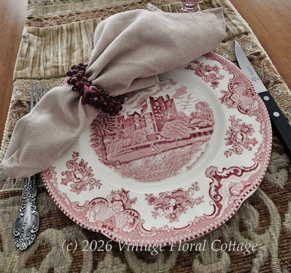
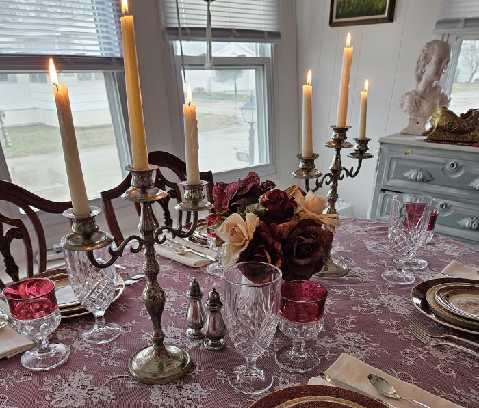
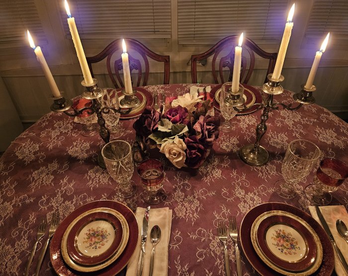
I’ve wanted to try a lace overlay tablescape for awhile now – they look very elegant to me, and I’ve come across some beautiful examples recently. But I haven’t been able to find a suitable lace tablecloth while thrifting, so I recently decided to purchase something inexpensive on Amazon just to give the look a try. (You can find the one I purchased here – Partisout Vintage Lace Tablecloth (affiliate link) – it was inexpensive enough that I expected to be disappointed, but I was actually quite pleased with it. More about that in a moment!)
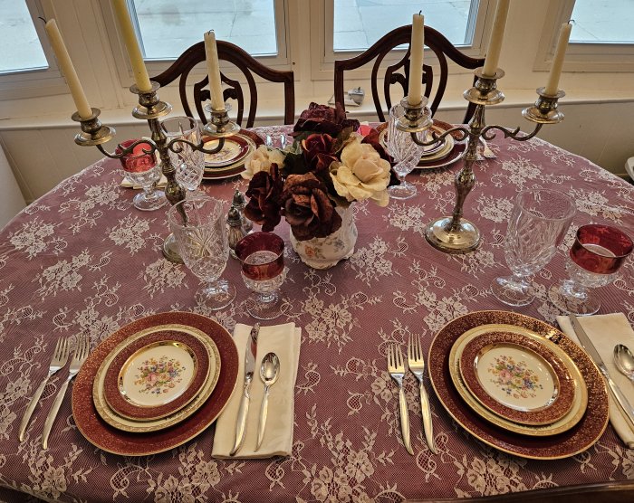
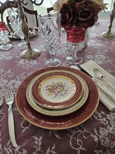
The solid-colored tablecloth was a thrifted find several years ago – it is a beautiful, deep cranberry color with a subtle fruit-and-leaf pattern. For this table I needed something that would complement the red band in the dinner and bread/dessert plates. With the cranberry color being diluted by the overlaid lace, I think it worked really well.
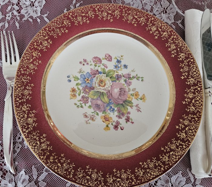
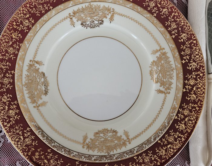
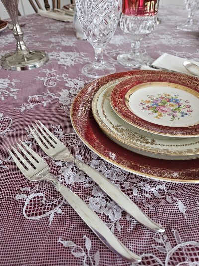
Dinner and bread/dessert plates are Aristocrat by Salem Century (Ebay finds), and the salad plates are thirfted Bancroft by Noritake.
Flatware for this lovely table is silverplated Flair by 1847 Rogers Brothers. I received this lovely set from my grandmother, which she had received as a wedding present.
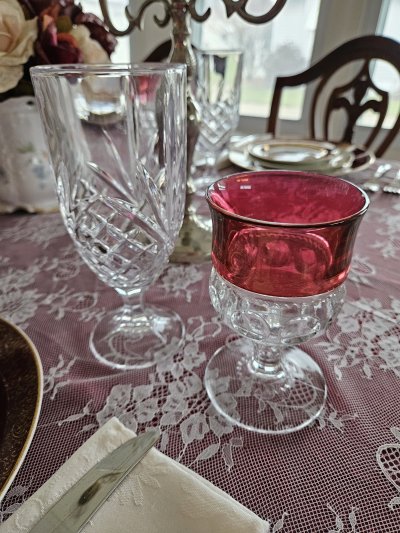
For glassware, I’ve paired Dublin by Godinger (an Amazon purchase you can find here – Dublin water glasses by Godinger – affiliate link) and vintage thrifted King’s Crown with cranberry rim.
Centerpiece elements were all thrifted and include an antique bone china biscuit jar, vintage silverplate candlesticks, and vintage Henley/Oneida salt and pepper set.
Earlier I mentioned that I really ended up liking the lace overlay tablecloth from Amazon. My expectation was that it was going to look and feel cheap, and that the white would be too bright for the table. I was pleasantly surprised at how soft and delicate it was, and also at how much the bright white was toned down once it was laid over the red cloth.
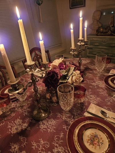
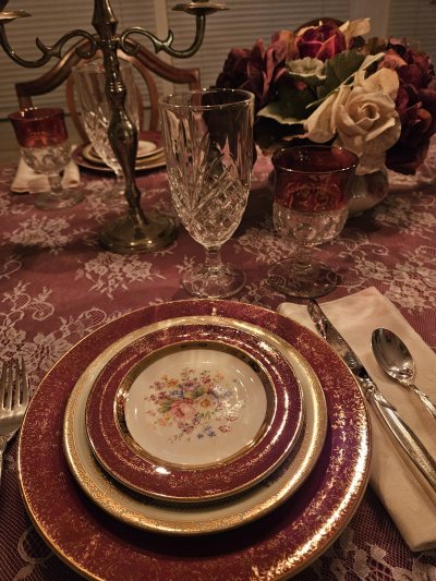
Here are a few shots in candlelight, which was also quite lovely.
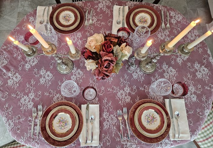
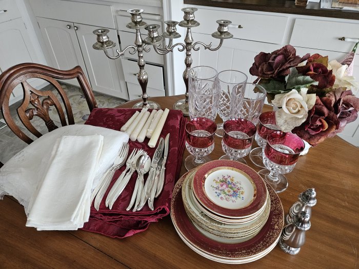
Here are the birdseye view and the put-away shot!
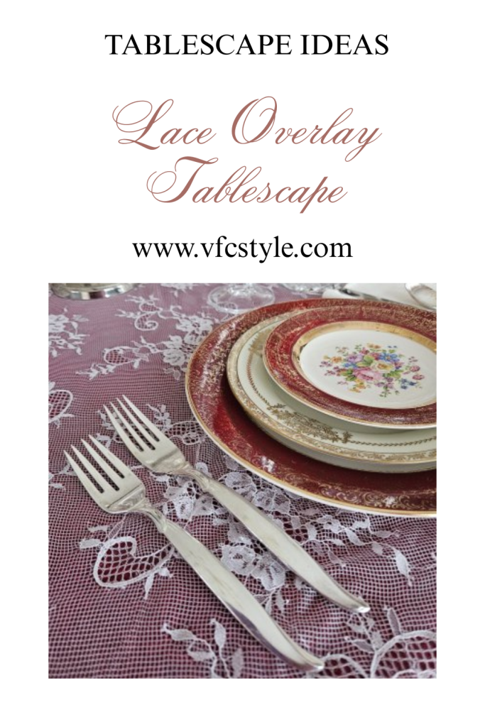
Finally, here’s an image to Pin if you would like to save this post for future ideas!
I’ll be sharing this post for Tablescape Thursday over at Between Naps on the Porch, hosted by longtime blogger Susan. Be sure to click through for more tablescape inspiration!
Meanwhile, for even more tablescaping ideas, be sure to check out the Thrifty Tablescapers group over on Facebook, where members share tables created with thrifted and other secondhand finds!
Some time ago, I discovered – through the magic of Internet-based television – a British food/history program called Royal Recipes. In the show, journalist Michael Bourke explores recipes that have been prepared for British royals, ranging from the Tudor period to present day.
In one of my favorite episodes, he discusses with chef Anna Haugh the difference between a dessert called a Baba and one called a Savarin cake. They prepare what is essentially an orange rum cake – a favorite of Edward VII, who was King from 1901 – 1910. (He put the “Edward” in “Edwardian!”)
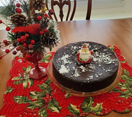
The finished cake looked amazing and I wanted to try to make it, but the show doesn’t provide recipes or even amounts for any of the ingredients – it’s more of a history program than a cooking show. So I went to Pinterest where I found several recipes for babas, savarin cakes, and orange rum cakes… and ended up combining and adapting a few different ones for the cake, the sauce/filling, and the glaze. I’m sharing the plan I eventually put together, and the many challenges I had making it!
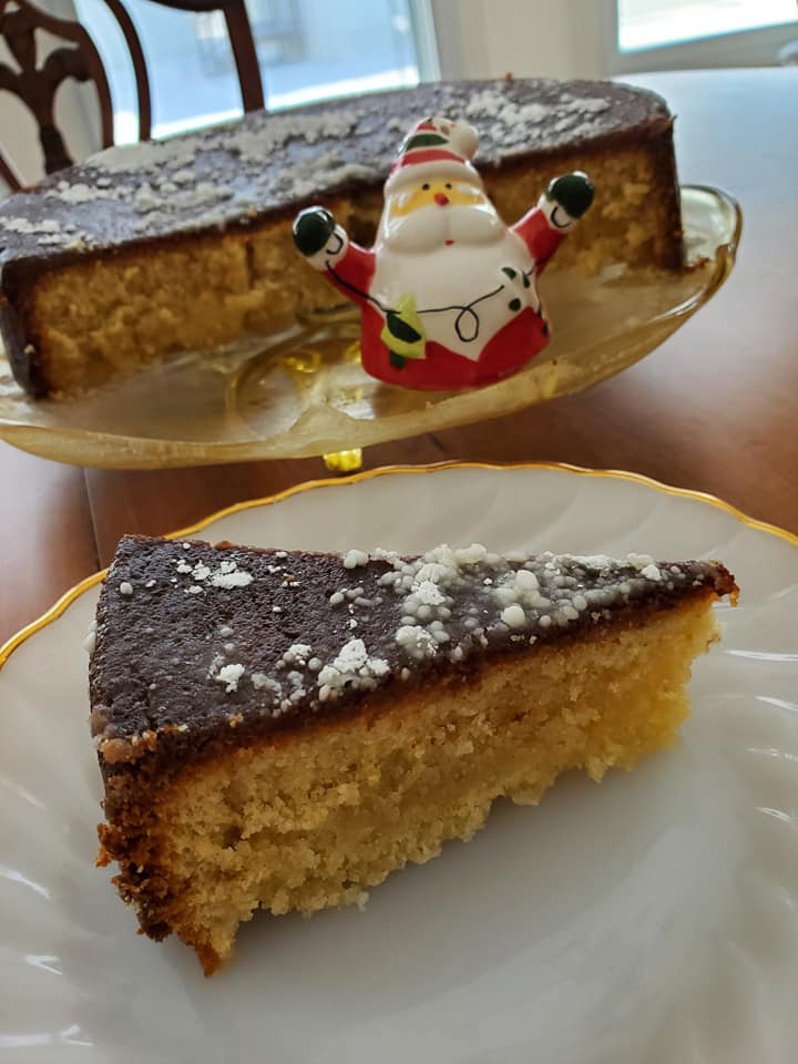
Now bear in mind, this is historically a ring cake, today made even more elegant by using a bundt pan. But I didn’t have a bundt pan, so I used a springform pan. Thus my cake looks nothing like the bundt versions. Also, because I wasn’t using the called-for pan, my baking time was way off from what was stated in the cake recipe. The only downside to this, other than my patience wearing thin, was the deeply-browned appearance of my cake vs. the golden color of the bundt cakes. Happily, none of this mattered in the end because my cake was nonetheless delicious!
For this recipe you’re going to bake the cake, poke and drizzle it while warm with an orange rum sauce/filling, and then glaze it when cool with butter rum glaze. Here are the recipes for all three elements – using a bundt pan!
Semi-Edwardian Orange Rum Cake
For the cake: 3 cups flour 1/2 tsp baking soda 1/2 tsp salt 2 sticks unsalted butter, softened 2-3/4 cups sugar 4 eggs 1 Tablespoon vanilla extract 2 Tablespoons orange zest 3/4 cup buttermilk 1/2 cup dark rum
Pre-heat the oven to 325 F. Spritz your bundt pan with a light coating of oil. (Tip: if your bundt pan is multi-faceted, like the one I eventually acquired, be sure your oil gets in ALL the crevices to avoid sticking.)
Mix together the flour, baking soda, and salt, then set aside.
In a large bowl, beat together the unsalted butter and the sugar. Beat in eggs one at a time; beat in vanilla and orange zest.
Gradually beat in the flour mixture, alternating with the buttermilk and rum, until all are thoroughly combined. Spoon into prepared bundt pan, and smooth the top. Bake 55-60 minutes until a knife inserted through the cake comes out clean.
Late in the baking stage, prepare the rum sauce as follows.
For the rum sauce/filling: 2 cups sugar 1/2 cup butter 1/4 cup dark rum 1/4 cup orange juice 1 tsp orange zest
In a medium saucepan, heat and combine the sugar and butter. Stir in and combine the rum, orange juice, and zest. Heat thoroughly.
When the cake is done, remove from oven and let stand 5 minutes. Using a toothpick or knife edge, pierce the top of the cake all around then drizzle the warm sauce all over, allowing it to soak into the cake. Let the cake cool.
When cake is cool, use a serated knife to cut off/level any portion that has risen above the top of the pan. Once cut, invert the cake onto a serving piece that has a lip to catch any drips. Prepare the glaze as shown below.
For the final glaze: 1 cup sugar 1/2 cup butter 1/4 cup water 1/4 cup dark rum
Warm all ingredients in a sauce pan and boil low for about 2 minutes. Pour the warm glaze over the cake so that some covers the top and some cascades down the edges. Do a final dusting with powdered sugar if you like.
I do now own a couple of bundt pans so I will likely try this cake again in the near future. But for now, my cake – being only 3 inches tall and deeply browned all around (though not burnt) made the most wonderful “wet sponge” sound when sliced, and had the most delicious orange-and-rum flavor.
So, even though it looks homely and inelegant, I have no regrets over the way this came out!
Pretty sure that party-boy Edward VII would have loved this cake even from a springform pan!


