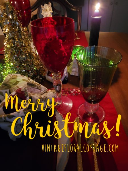
Wishing you and yours the loveliest Christmas!
It’s almost Christmas already and… while it’s definitely going to be a white Christmas, it’s also going to be a ridiculously COLD one. We’ve been in below-zero temperatures and below-zero double-digit windchills for a week now. I hope you are staying safe and warm!
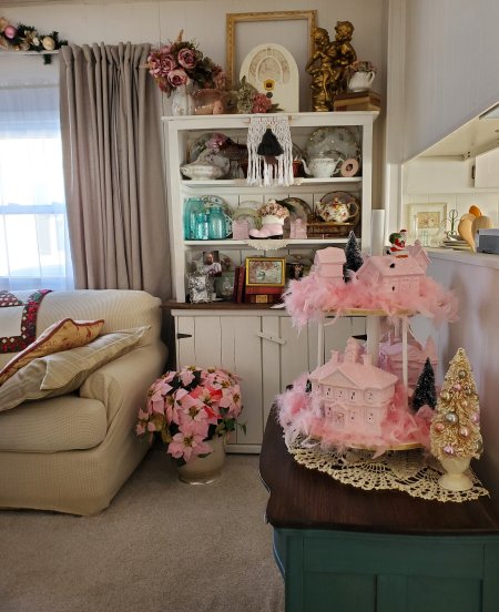
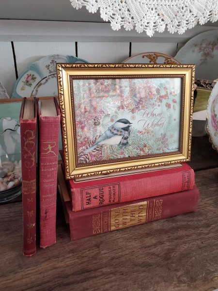
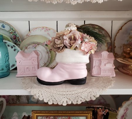
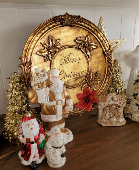
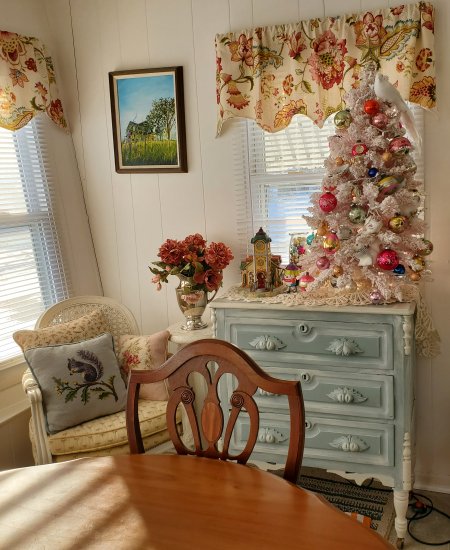
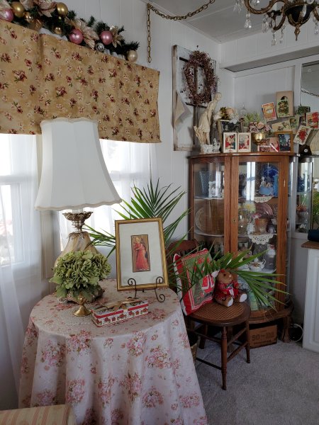
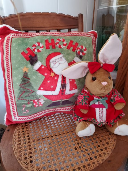
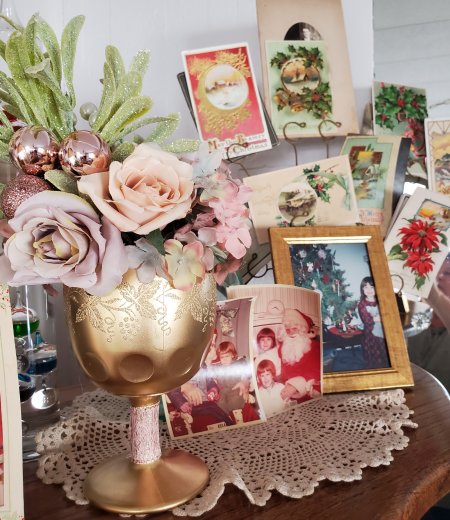
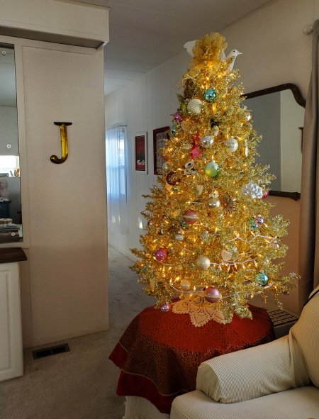
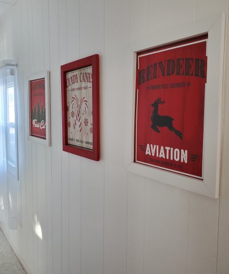
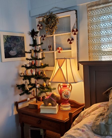
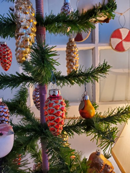
My decorating style is definitely evolving (more and more “What’s in the Downton attic?” creeping in!) but thrifted, secondhand, handed down “Vintage Floral Cottage” is still very much at the heart of it! I thought I would share a few pictures of my tiny mobile home all decorated for Christmas!
Hope you have a lovely, merry Christmas!
Here we are at the shortest day of the year already – I’m so glad to share a Winter Solstice tablescape and for the days to start getting longer!
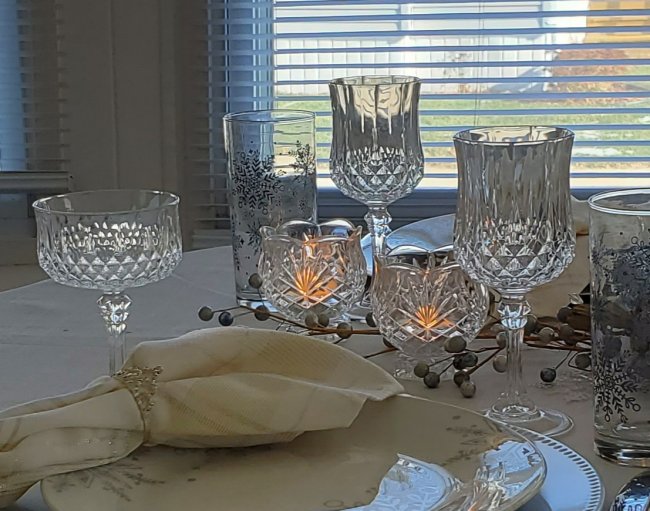
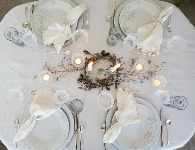
Back in… hmmm I think it was November… I went into Dollar Tree and saw the prettiest Winter dinnerware: bright white, with metallic silver snowflakes in a big, bold pattern. They had dinner plates, soup bowls, and coffee mugs, plus two styles of coordinating glassware where the snowflakes were kind of silvery blue-gray. I bought four dinner plates and four ice tea tumblers, plus 4 silver chargers because I didn’t have any in that color yet. Now as it turns out, it’s really hard to photograph a table that is mostly silver and white – at least for me since I use my phone for photography – but I promise you, even if you can’t see it very well, it’s gorgeous!
Here’s my Winter Solstice tablescape!
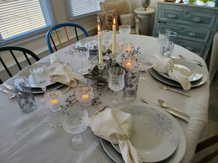
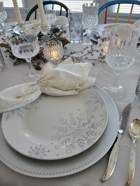
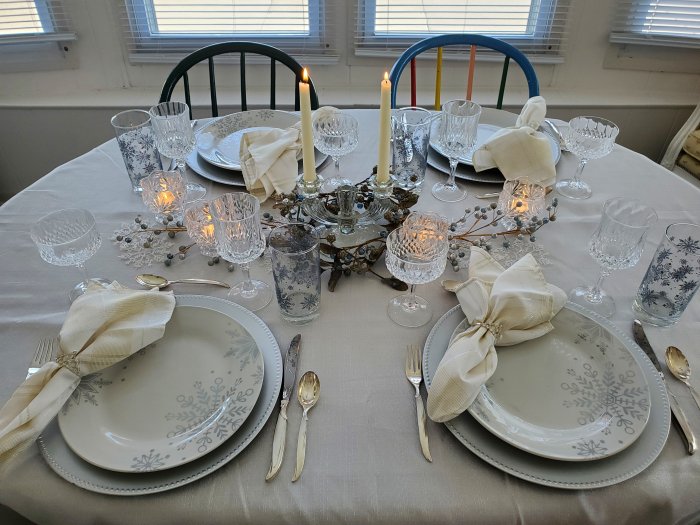
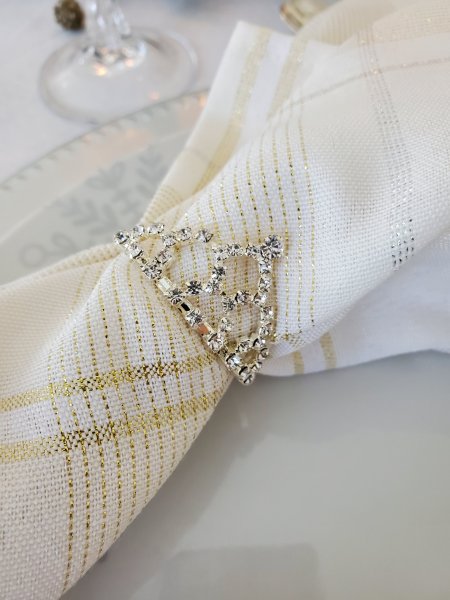
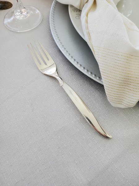
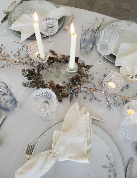
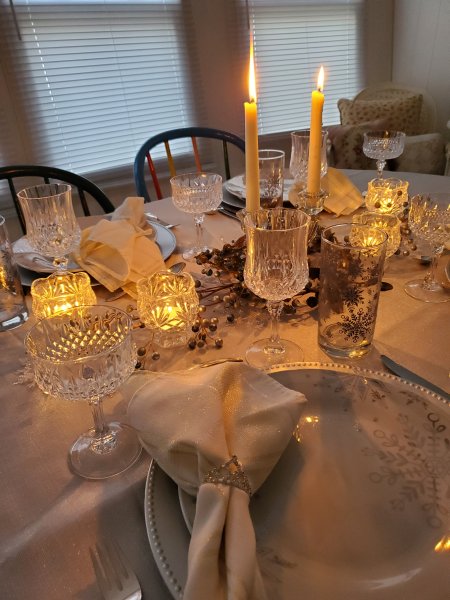
See what I mean – especially below – really hard to photograph all that silver and white, especially in daylight. Hopefully the candle-lit shots give you a better view. Chargers are silver plastic, napkins are ivory with silver and gold metallic threads, the napkin rings are little jewel-studded crowns. And the plates are white ceramic with metallic silver snowflakes.
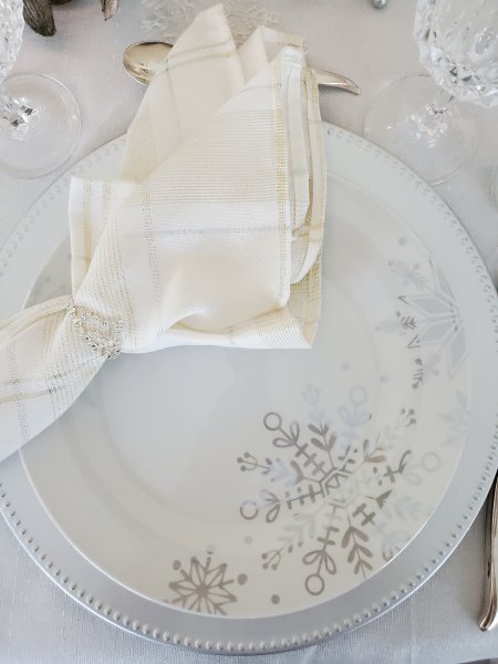
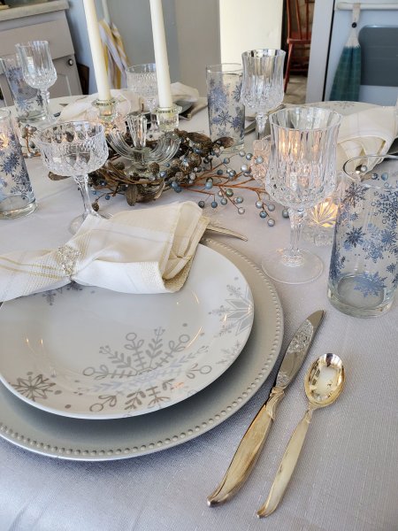
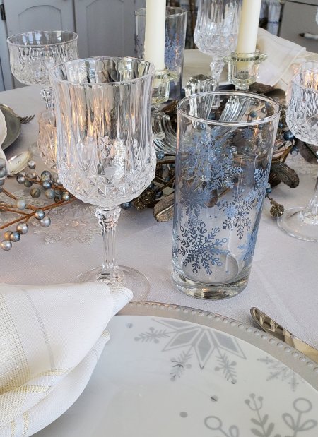
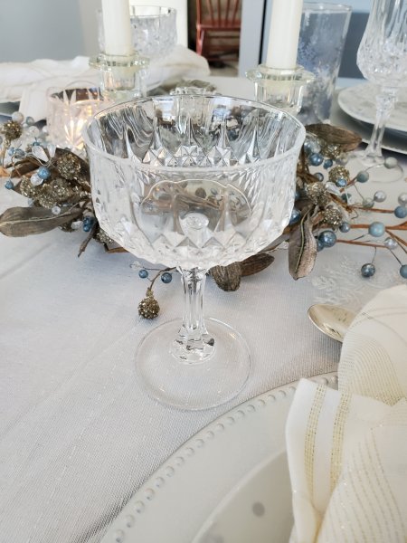
Glassware is comprised of the Dollar Tree iced tea tumblers, plus thrifted Cristal d’Arques “Longchamps” wine glasses, and more Longchamps for the dessert compotes.
Silverware is my handed-down “Flair” by 1847 Rogers Brothers, inherited from my grandmother. I don’t think you can tell but the tablecloth is shimmery with silver threads.
The centerpiece is a crystal taper holder surrounded by a silvery blue beaded wreath and flanked by additional crystal candle holders plus blue-gray pip berry stems.
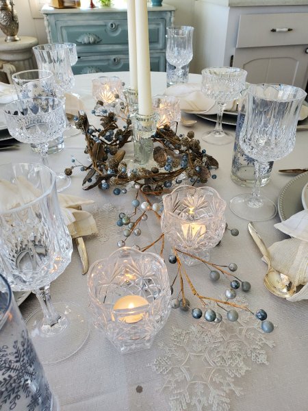
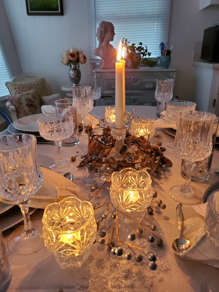
A few more views, including some in candlelight…
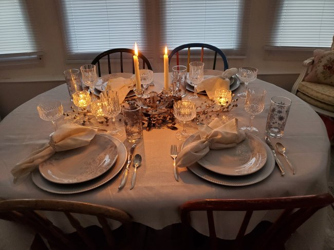
A birdseye view…
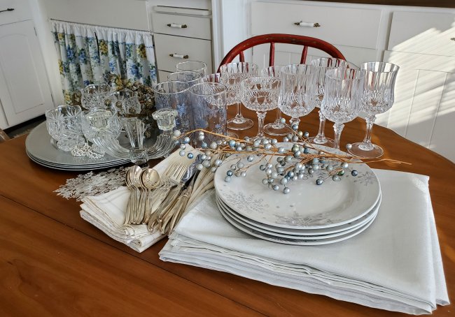
And a put-away shot, illustrating how pretty everything looks just waiting to go back into the cupboards.
I’d love to know how you get along during this time of year. Do you do anything to commemorate the Solstice? This is the first year I’ve done so with a tablescape. What are your thoughts about shorter daylight hours and the Winter Solstice? As always feel free to leave me a comment with anything you’d like to share!
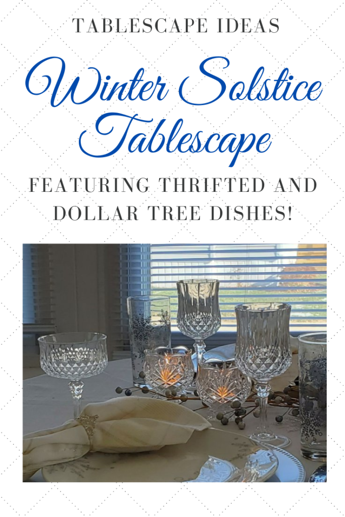
Here’s an image to Pin in case you would like to save the Winter Solstice tablescape for future inspiration. This one could easily be a Christmas or New Year’s tablescape, too!
I will be linking to Tablescape Thursday over at Susan’s lovely blog, Between Naps on the Porch – be sure to click through for more tablescape inspiration!
For even MORE inspiration in setting lovely tables on a budget, join my Facebook group, Thrifty Tablescapers! Lots of friendly folks over there sharing their amazing thrifty tablescaping ideas!
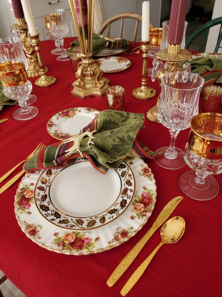
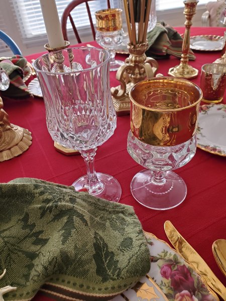
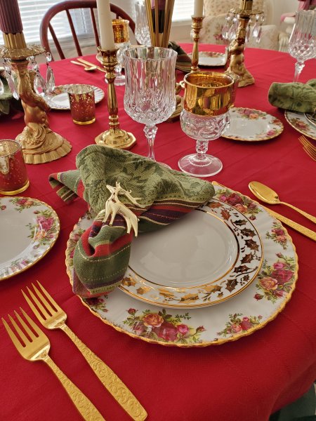
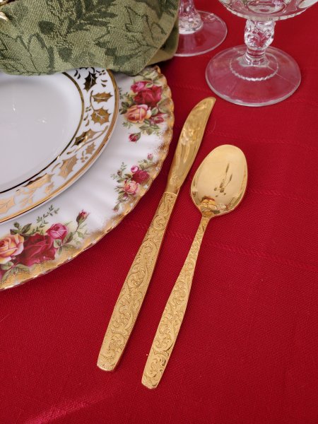
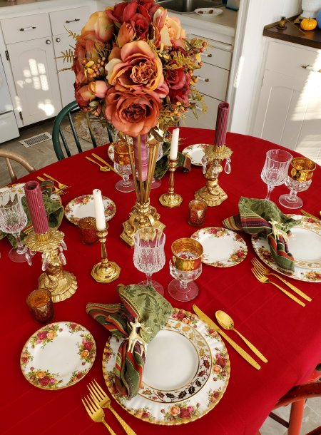
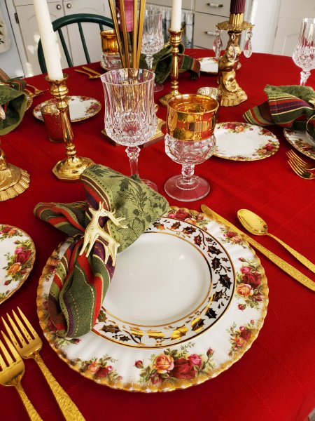
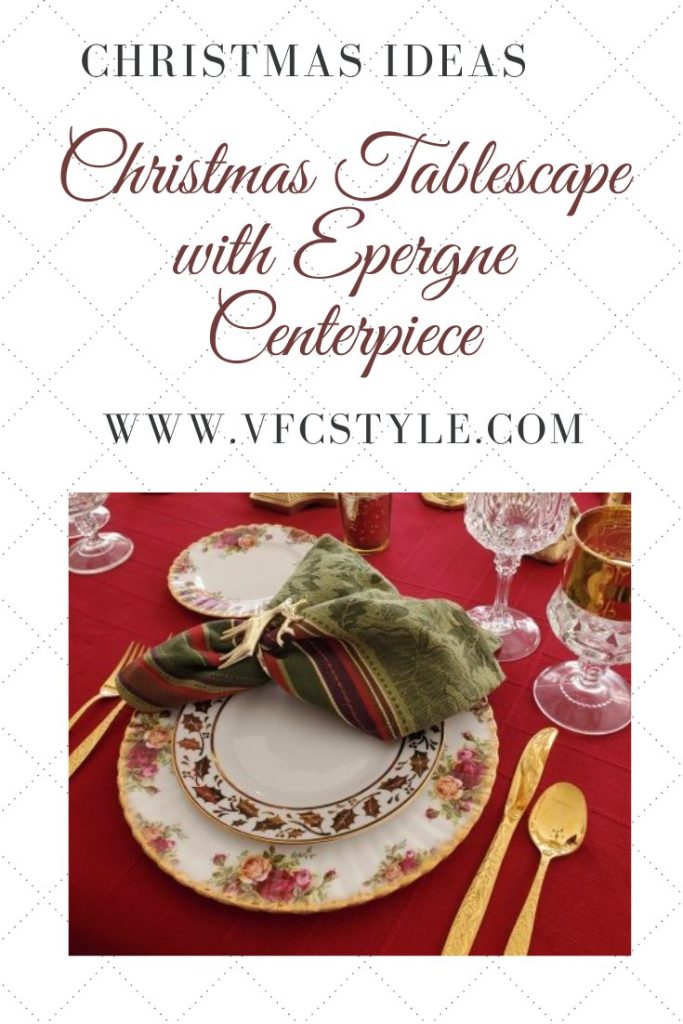
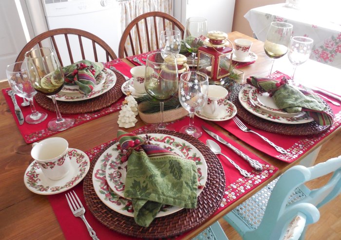
All through the year I set pretty tables with a lot of different vintage dinnerware patterns. But for a Christmas tablescape, I always seem to gravitate back to my all-time favorite, Old Country Roses by Royal Albert of England. Although my collection of this pattern is indeed secondhand, I don’t collect it in thrift stores because I never see it in those shops – it just doesn’t get donated, at least in my area! Over the past 20 years, I’ve collected dinner and bread plates from Ebay, always looking for the oldest possible backstamp. (This pattern was introduced in my birth year, so I like to think that my set is at least almost as old as I am!)
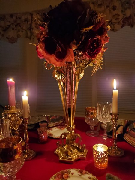
Now if you have read much on my blog, you might recall from my Tablescaping 101 series (which is still not finished yet, by the way!) that one of my “rules” is that the centerpiece should not block guests’ view of each other from any angle. For that reason, I keep my centerpieces shorter in height.
But… guys…
…seriously…
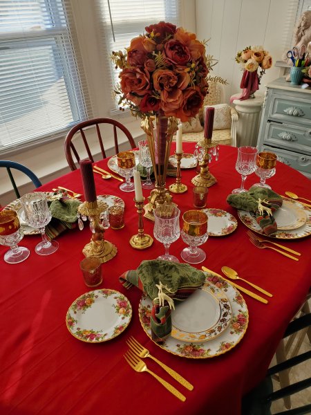
So here’s the thing: I found a metal base for pillar candles over the summer, and in Fall I found the most beautiful fully-assembled bridal bouquet. Both in thrift stores, less than $10 total for both items!
For my Christmas table this year I wanted to do an epergne-style centerpiece using that candle base with a pineapple on top – I had read that pineapples at one time represented the epitome of wealth and status – if you had one in your centerpiece, you had made it! And so I tried perching various bowls or other dishes on top of the candle base to hold a pineapple, but nothing looked quite right. At that point I began shopping the house, and my eye fell upon the bridal bouquet which was in a vase in my office and… well, I ditched the pineapple and suddenly my centerpiece was fabulous!
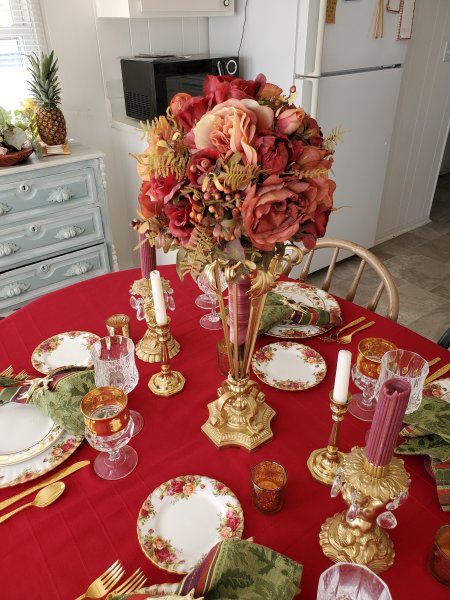
I know it’s too tall. I know it breaks a rule. But it is so worth it! (I feel like such a rebel) Now in my defense, I would leave the centerpiece in place until guests are seated, and then remove it to the sideboard during the meal. It’s just too beautiful to leave it off completely.

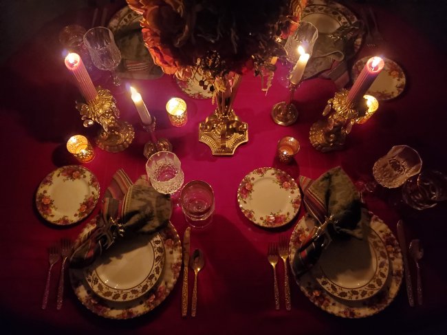
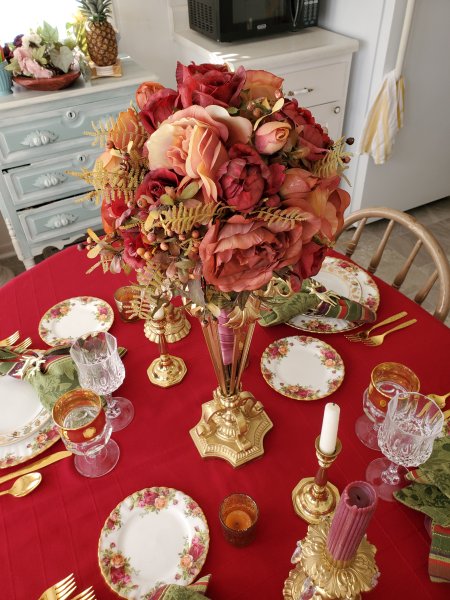
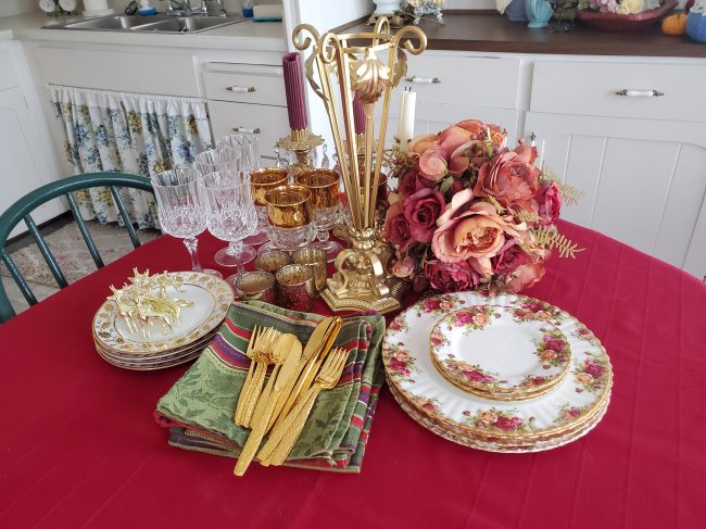
Okay enough gushing, let’s take a quick tour around the table! Dinnerware as I mentioned is vintage Old Country Roses, and the salad plates are not marked – I found dinner and salad plates in this pattern at my favorite consignment store last year. Of course I bought four of each – less than $10 for all!
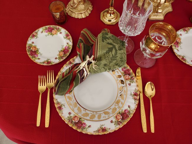
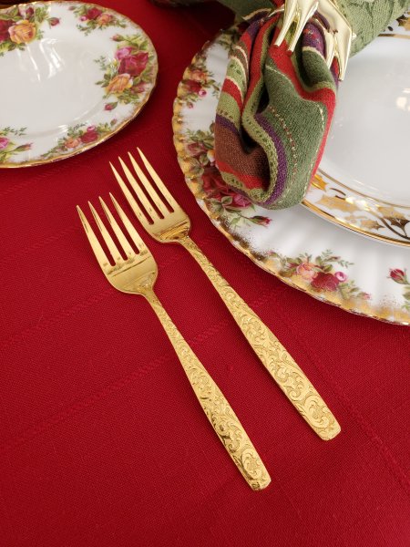
Flatware is Americana Golden Heritage by International Silver, an antique store find several years ago – also a bargain at $12 for service for four plus a few serving pieces!
Glassware is Longchamps crystal by Cristal D’Arques and antique King’s Crown “Thumbprint” by Indiana Glass. LOVE that wide gold border!
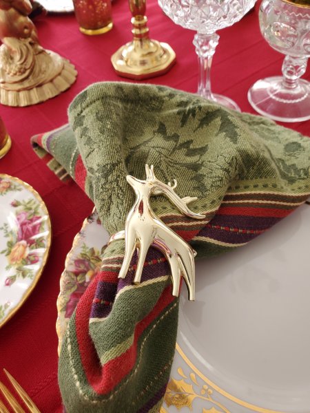
Napkins and napkin rings were thrift store finds many years ago. I use these deer almost every year for Winter and Christmas.
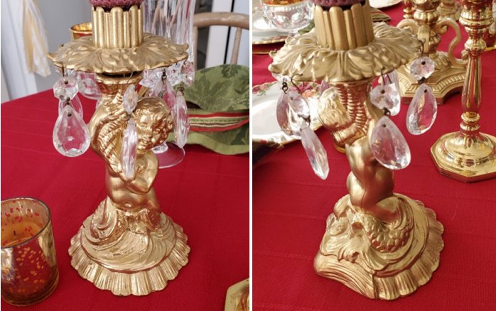
There are candles included in the centerpiece as well, because I do believe that candlelight creates a special kind of magic in any tablescape – especially at Christmas! There are thrifted votive holders and a pair of brass sticks, but also these amazing thrifted figural taper holders – the character is like a mer-creature… a cherub, but with tentacles!
Here are a few more views around the table…
… a few pictures of candlelight magic…
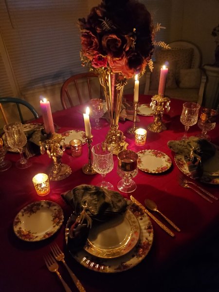
… and finally, one more centerpiece view plus the put-away shot!
I’ll be sharing my Christmas table over at Tablescape Thursday on Susan’s amazing blog, Between Naps on the Porch.
And, here’s an image to Pin in case you’d like to save this post for future inspiration:
I feel like it’s “idea week” here on the blog… we had Christmas centerpiece ideas on Monday, crafts on Tuesday, and tablescape ideas today. And tomorrow, I’ll be posting my full 2022 Christmas tablescape, though there’s a sneak peek of it included at the end of this post. 🙂
Each of the tables here has its own blog post, which I’ll link for you so you can see more photos and get all the details. The best part is, everything used in these Christmas tablescapes is secondhand: handed down, thrifted, found at antique malls or flea markets, occasionally scored on Ebay, or occasionally not secondhand but for sure found on clearance – hey, ya-girl here is CHEAP, so… everything I do is affordable and represents another victory in “the thrill of the hunt”!
Ok, on with the parade of Christmas tablescapes!
First up, two tables for two!
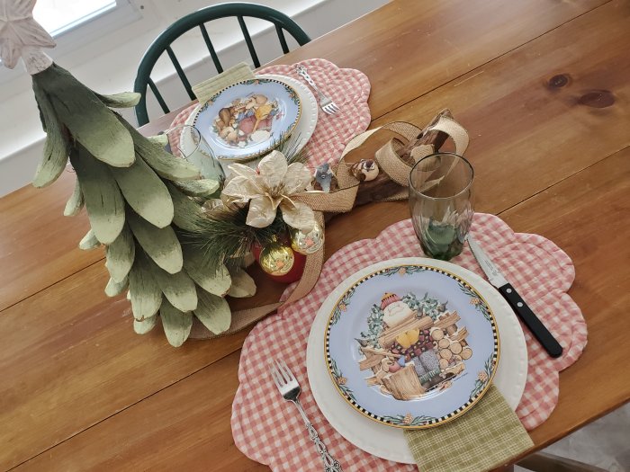
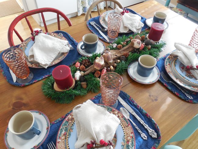
This one is a very simple setting featuring “Woodland Santa” salad plates.
And here’s another look at the table for two I just shared a few days ago, featuring vintage Royal Ruby salad plates by Anchor Hocking, in the unique square shape called “Charm.”
Next, here are my favorite casual Christmas tables!
This one features “Christmas Ribbon” by World Bazaar:
Here’s more of the “Woodland Santa” coordinated dinnerware set. These were created by illustrator/artist Debbie Mumm. Be sure to click through to the full post to see all the chores Santa is doing outside!
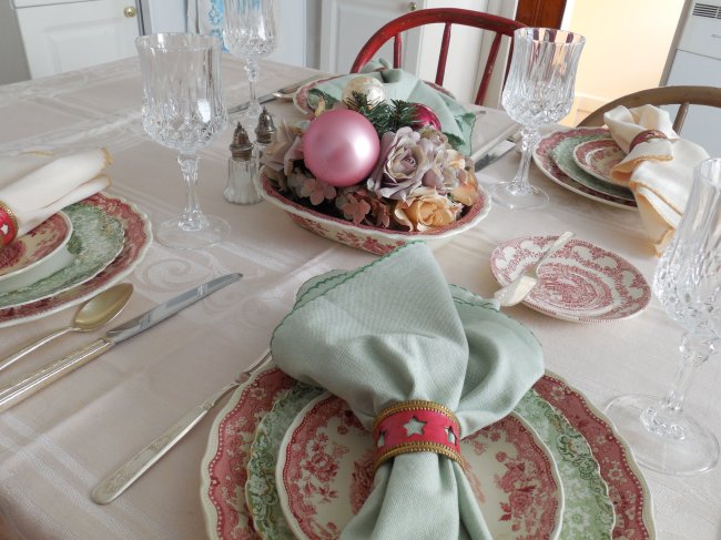
Next, here are a few more elegant Christmas tables!
This very simple table was envisioned for a Christmas luncheon and features two different sets of antique transferware: “Shannondale” by Ridgways of England, and green “Roxbury” by Alfred Meakin, also of England.
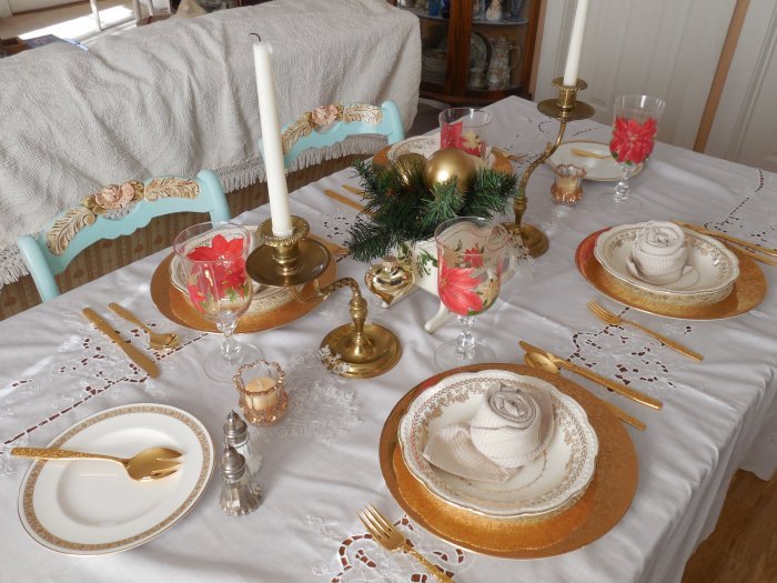
You’ll see that I really love going over the top with gold – this table is a favorite (even though the flatware is placed incorrectly – horrors!) because of those amazing dinner plates. They are not marked, but the wide gold shoulder is just amazing!
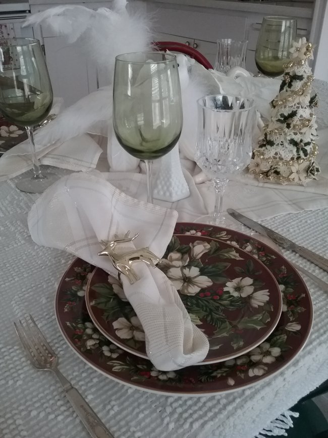
The next table was photographed on an overcast day so the color of the dinnerware didn’t come across very well but they are a deep maroon with the beautiful white blooms. The pattern is called “Splendor” by Sakura.
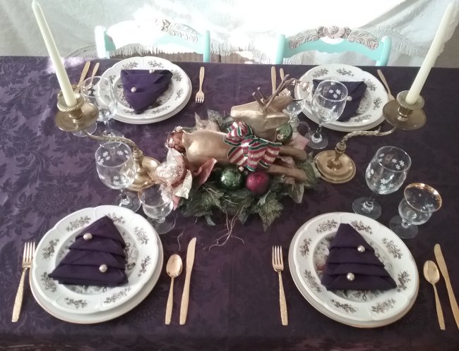
Johnson Brothers “Windsor Fruit” was the featured dinnerware pattern in this table – the deep purple tablecloth echoes one of the hand-painted shades on the plate, and I had fun folding and decorating the napkins on this one!
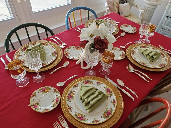
Finally, here are two Christmas tables featuring “Old Country Roses” by Royal Albert, my all-time favorite pattern.
I collect “OCR” very slowly from Ebay, making sure I always get the oldest backstamp because this pattern came out the same year I was born. The tables look similar, but there are some beautiful differences. This one is from 2020:
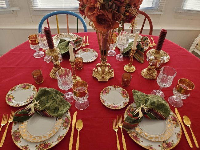
And here’s a preview of this year’s Christmas with Old Country Roses table – no link yet for this one, but I’ll update this round-up as soon as the individual post is up.
Hope these will each give you one or two ideas to steal for your next tablescape, and hope you have FUN putting together your table this year!
For much more Christmas tablescape inspiration, please join us over in the Facebook group, Thrifty Tablescapers, where you’ll find a very creative group of kindred spirits who share the love of creating beautiful tables on a budget!
Here’s an image to Pin if you’d like to save this post for future inspiration – and, I’ll be linking up over at Susan’s beautiful blog, Between Naps on the Porch, for Tablescape Thursday.


|
|
|
|
|
 |

Click the book cover image to purchase for just $2.99!