I think the biggest challenge in specifically creating a Faded Summer tablescape is to not forget about the word “faded.” For me, a summer tablescape could be based on a garden, a beach, a visit to Disney World, or any summer activity. And of course, it’s still summer so those themes definitely still apply.
But while it is still summer, over here it’s technically Faded Summer (for more about that, click here to pop in your email address and grab your free PDF version of the official guide to the unofficial fifth season!). To me that’s definitely garden-related because the color palette comes from the colors of fading flowers. And it’s not always simple to capture those colors in dinnerware, especially if you’re like me and rely on the whims of finding things in the thrift stores to build your tablescaping collection.
This year’s Faded Summer tablescape does a particularly good job of capturing the colors and textures of the unofficial fifth season. It still looks like summer, but a faded or more muted version of those summer colors.
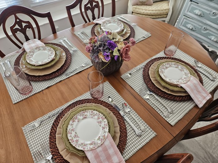
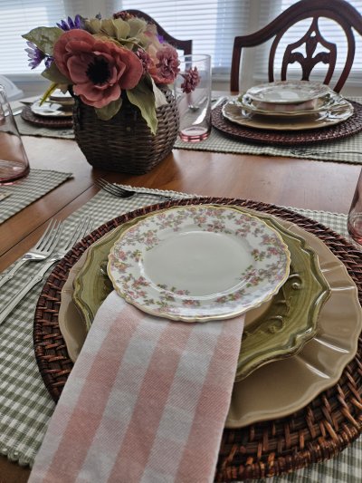
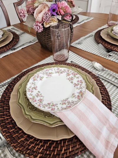
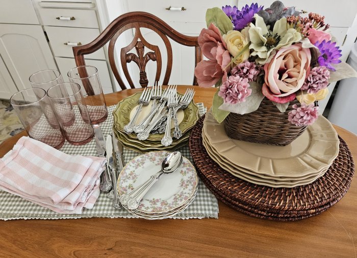
Each place setting is grounded by a green-checked placemat in muted “botancial” green, and textured rattan chargers in deep brown.
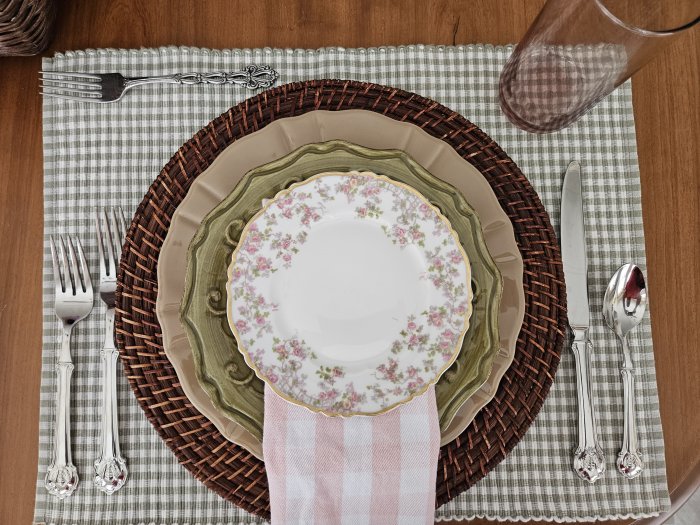
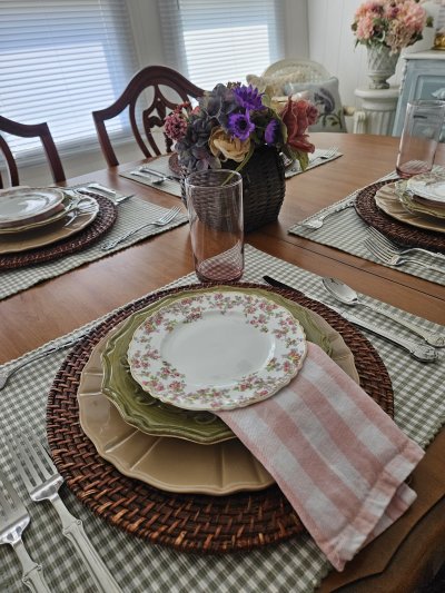
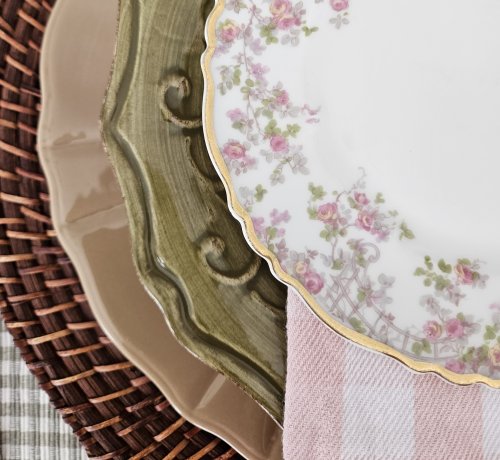
I love using this antique Limoges pattern by Haviland in a Faded Summer tablescape because the pattern is pretty and gardeny but not too brightly-colored. It’s called “Trellis.” The dessert plate looks lovely over the “faded green” pottery salad plate, with the heavy-textured faded pink-check napkin underneath. The plain taupe dinnerplate makes a great backdrop not just for the rest of the plate stack but also for the food that will soon be placed upon it.
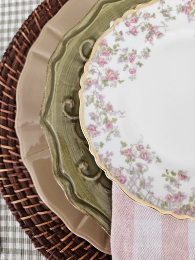
Oh those lovely edges and textures!
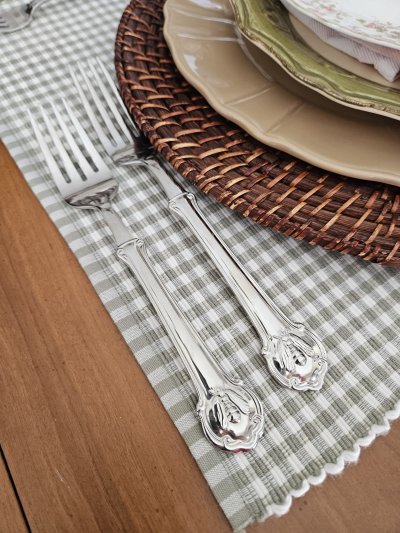
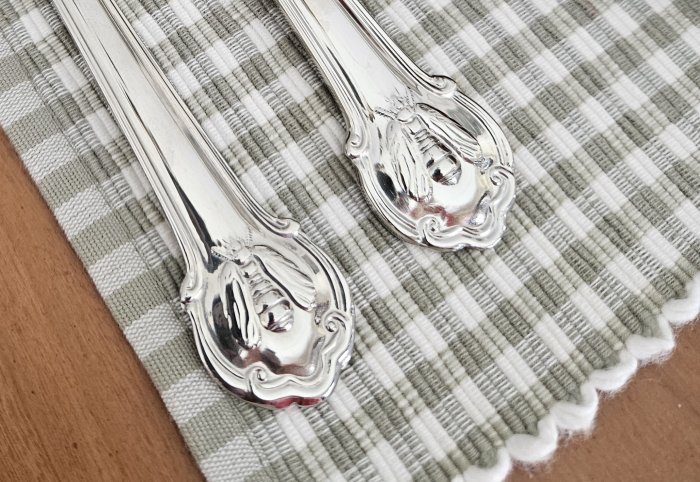
Our flatware is “Napoleon Bee” by Wallace. (<– This is an affiliate link – I earn a small commission if you click through to Amazon to order yours, but it costs you nothing extra!)
Our glassware/tumbler is vintage “Metropolitan” by Libbey in a perfectly muted plum tone. I adore this color for Faded Summer – it’s even echoed in the floral colors of the centerpiece.
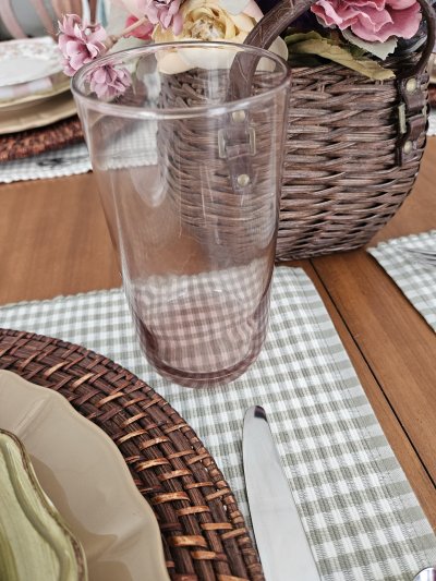
Speaking of the centerpiece, you can see I didn’t go overboard with that this year (like I might have in years past) but of course it uses silk flowers in the deepening hues of Faded Summer as well. They’re collected into a textured woven basket – almost Fall but not quite!
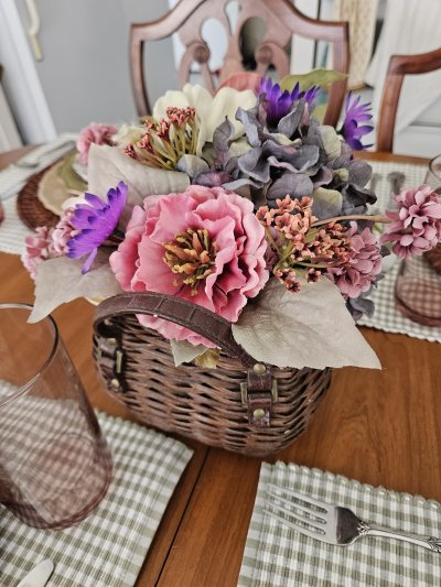
Here are a couple more views. I placed a dessert fork in the upper left of each place setting but I didn’t get a close-up picture of it. It’s my gorgeous handed-down “Chandelier” by Oneida. It will of course be used with the Haviland Trellis dessert plate, which as a guest you would remove off to the upper left of the place setting just prior to picking up your napkin.
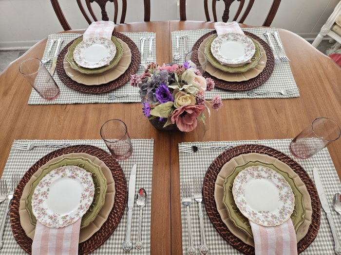
And that’s it – a simple, lovely Faded Summer tablescape that provides a visual “rest” between the tropical colors of Summer and the bold colors of Autumn. I love doing these put-away shots – they show how well everything coordinates together, just before it all goes back into the cupboards.
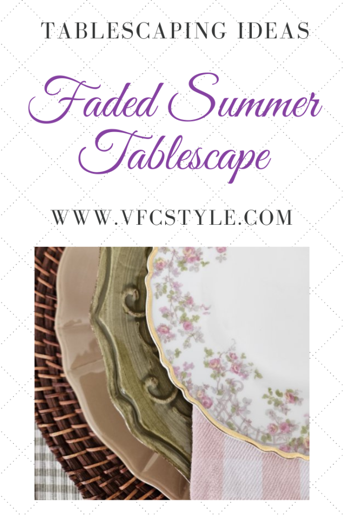
Here’s an image to Pin if you’d like to save this year’s Faded Summer tablescape for future ideas.
I will be sharing my Faded Summer Tablescape for Tablescape Thursday over at Susan’s lovely blog, Between Naps on the Porch. Be sure to click through for more tablescaping ideas!




I love the “Faded Summer” description – so perfect for that in-between season! And your table is lovely. I agree with you about how lovely a stack of plates can be with their different colors and edges! 🙂 Thanks for the inspiration today, and hope you have a wonderful end of summer!
Barbara, thank you so much for stopping by and for the kind note! Combining different colors and edges is one of my favorite aspects of tablescaping!